A belated post to point you to an article I wrote for the June/July 2017 issue of Creative Review on the brand purpose movement. Here is the article.
Make America Grumpy Again
A brief post to mark a milestone / millstone in our lives.
Last week the US edition of Perpetual Disappointments Diary officially came out with Chronicle. (This follows the UK edition being published by Pan Macmillan last year, which in turn followed us publishing it ourselves for several years independently.)
As expected, Chronicle have done a beautiful production job on the diary, with an especially nice cover stock, smart embossing, and a cool sheet of blue Monday stickers.
The diary includes some changes for the US market, including some more US-centric Notable Deaths (sorry Hovis Presley), some tweaked cultural references (Kestrel Super makes way for Sierra Nevada Hoptimum IPA), and some new proverbs, complete with US spellings.
March is an unconventional time to bring out a diary, but hopefully it’ll give it time to get into US stores before Christmas, by which time 50% of the current administration may be using it to write their prison memoirs.
On that note, we discovered this post by a Disappointments Diarist on Instagram:
Advertising versus Trump
I hesitated to publish this post, because it’s criticising someone else’s work and, even more ungraciously, trying to rewrite it.
But my defence is that it’s a public interest project (supporting a free press against Trumpian bullshit), so there’s more at stake than with most projects. It’s also by a great agency who I have said nice things about (Droga5, who did brilliant work for Hillary Clinton, even if you can criticise the appeal-to-the-core-vote strategy on which it was based).
So here goes.
The New York Times has produced an ad campaign in response to the continued attacks from Trump, and it has received murmurs of approval on social media – mainly, I suspect, because people sympathise with the cause, and also copywriters in particular like anything that only involves copy.
But I don’t think it works. And it’s frustrating, because it was a chance for advertising (and writing in particular) to step up and show the world the difference we can make. We’re supposed to be the experts at persuasion. Maybe we can be the ones who cut through the bluster and bullshit of Trump. For once, instead of making Dove look good or making people cry at John Lewis, we can take on Trump and do something useful.
But then the big, high-profile brief comes along, and this ad misfires. Not on an aesthetic level, but on the basic functional level – it fails as persuasion, and possibly has a net-negative effect as it could turn off some supporters.
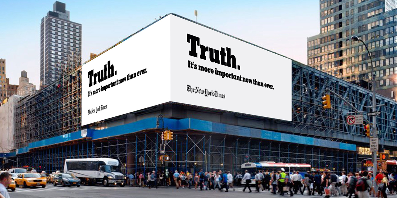
The billboard (above) is the most obvious distillation of why the whole campaign is off-track. To say ‘Truth. It’s more important now than ever’ and sign off with your logo is to equate the NYT with the truth, which is an absurdly overblown thing to do. But it’s happened because they’ve allowed themselves to be painted into a corner. They’ve accepted the terms of Trump’s playground ‘FAKE NEWS!’ argument and gone to the other extreme – we are the guardians of the real truth! And by doing that, they confirm the worst preconceptions people have about the press – that it’s an elitist, out-of-touch, self-appointed authority.
The TV spot spells out the argument more, but it’s the same problem. The NYT is casting itself as the arbiter between competing versions of the truth, but does nothing to justify that position. It sounds elitist and dogmatic – all the things you don’t want.
That comes out even more clearly in the press ad, which is a series of manifesto-like statements that don’t stand up to much scrutiny. Again, the effect is po-faced and patronising. The truth is hard. It’s complicated. It’s probably too hard for you to figure out. Leave it to us. This is important.
The maddening thing is that this is a smart publication and a smart agency falling into a trap set by Trump – not because he’s some genius of persuasion, but because he communicates in such childishly big crayon scribbles that people miss how simple they are. In calmer times, the New York Times would never claim to be about ‘truth’. It’s about facts, which aren’t the same thing. As the old line goes, it’s about ‘all the news that’s fit to print’ – i.e. that meets certain standards of editorial rigour. That’s a much more meaningful, grounded thing to say than ‘The truth is more important than ever’.
They’ve been bounced into that position by the cartoonish rhetoric of Trump. It’s difficult to keep a cool head in such heated times, but I think the job of the ad agency should have been to get them to take a breath, avoid the obvious reaction, and reframe the whole argument in their favour.
I won’t presume to provide the whole answer, but I know where I’d start.
I’d list those negative preconceptions about the media and then go the other way. Instead of elitist, go popular and empowering. Instead of out-of-touch, go down-to-earth. Instead of self-appointed authority, go modest and democratic.
It’s not about the NYT being fake or true. It’s not about Trump being fake or true. It’s about the people. Truth is up to the people to decide. The NYT is a supporter of the people. It provides people with the tools to make up their own minds. It asks the questions and reports the answers. But always in service of the people. Make them the hero of the argument – they also happen to be the target market.
That could lead to something like:
Don’t count on the New York Times to tell you the truth
Don’t count on the President either. Or CNN. Or Fox. Or everyone on Twitter (sorry everyone on Twitter).
We know you’ll make up your own mind about the truth.
Our job is to help you put some of the pieces together.
We’ll provide verifiable facts, investigative reporting, and diverse opinions.
We’ll ask questions to people in power. And the madder they get, the more we’ll keep asking.
We’ll be a voice for the silent majority and the silenced minorities.
We’ll keep publishing all the news that’s fit to publish, online and in print.
And we’ll work with you to do it.
Send us your stories.
Tell us your truth.
We’re counting on you.
Even if you don’t like the ad, it’s a better strategy. It changes the conversation, instead of just continuing it.
But you could still say it’s too defensive. Another option would be to go on the attack. Make it about Trump, not you. The comically obvious thing about his ‘fake news’ attacks is that he’s trying to undermine the credibility of the people who are most likely to bring him down. It’s a hysterical pre-emptive tantrum because he’s scared. So point that out. Something like:
If there’s one thing we’ve learned in 166 years of holding power to account, it’s this. The angrier they get, the louder they get, the more hostile they get – the more interested we get. And the more questions we ask.
That’s not the whole thing, but it’s something. It’s a counter-narrative. It means the next time he shouts 'Fake news', you’ve already framed it as a distraction technique. You could print a variation of that paragraph in small type on a giant poster site and promise to make the type bigger every time Trump says ‘Fake news’.
But probably the biggest ‘take the high ground’ move would be to ignore Trump altogether and use the moment as a platform to connect with the people. Even before Trump, the NYT had a problem with appearing elitist and old-fashioned – but the sheer extremism of the Trump attack is the perfect opportunity to reposition. Use the ads as an invitation to get people to send in their stories, or to launch a new journalism prize for rigorously researched articles by young people on issues that matter. Don’t try to make the ad the answer – do something new and grassrootsy, then talk about it.
Or don’t do any of the above, because someone somewhere will have a better idea – probably someone at the NYT or Droga5, because they're smart people. I don’t think this one nailed it, but it’s useful to talk about why, before the giant political whirlwind moves on somewhere else.
As a footnote, I saw the Washington Post went with 'Democracy Dies in Darkness'. It’s not the most cheerful line (people have commented on its goth vibe), but it’s decent and meaningful. And the simple masthead change probably got as much publicity as the more expensive NYT campaign.
Maybe 'Democracy Lives in Light' would go down better with your morning coffee. But I can’t really talk as the writer of the most depressing diary in the world, which comes out in the US on March 14th. (Yes, this whole thing has been an ad and therefore = fake news.)
One last note – Stephen Colbert's The Late Show has parodied the NYT ad and made it into something much better. This at least is a sign it has made a cultural impact in pretty quick time. Maybe it's great.
Review of the year 2015
‘Review of the year’ is a grand title for what is mainly a review of things I’ve tweeted / favourited (now ‘liked’) over the last year. I’ve also been less active than usual online, so this will miss out a lot of things. But apart from that, here is my comprehensive and authoritative review of the year.
Best brand conversation
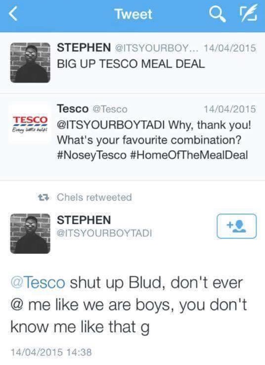
Brands having conversations are like people pretending to be on the phone. You chat away, nodding and chuckling at imagined jokes – but then the phone rings and everyone laughs and points at you. For a brand, there’s nothing more disconcerting than when a real person answers back. Tesco wins the best brand conversation award for the Twitter exchange above, closely followed by this one:
Worst brand conversation
This was the year that Andrex launched a five-step guide to wiping your backside and asked us all to have a conversation about it. I wrote about it here: Conversation my arse
Trend of the year (runner-up)
Brands doing feminism and getting it wrong. Sometimes it’s obvious and almost endearingly cack-handed, like Bic Pens celebrating International Women’s Day, or the recent IBM #hackahairdryercampaign. Other stuff gets celebrated widely, but is arguably worse. This Mindy Kaling article (last few paras) should be required reading for the Always and Dove marketing teams, who confidently tell the rest of the world how to do feminism, with the passion of a recent convert.
Non-trend of the year (winner)
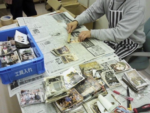
Non-trend, because it’s not something that happens much or gets shouted about. But there are examples of brands doing serious social good, without making a song and dance about it. This Ricoh Save The Memory project is a painstaking, years-long, open-source effort to rescue thousands of photographs lost and damaged in the Japanese tsunami of 2011. It’s properly useful, but it’s hard work.
Trend of the year (winner)
This probably has to be emojis. I don’t actually mind emojis – they’re fun. What grates is the media consensus that any project or press release that contains the word ‘emoji’ is now automatically and hilariously innovative and ‘now’. (Before this, it was ‘selfie’, which still retains some of its talismanic power, although it’s starting to wear off.)
So Domino’s wins accolades for ordering a pizza by emoji. Dove solves everything by releasing curly-haired emojis. McDonald’s upsets copywriters everywhere with an emoji-only ad (above – the last emoji was added by a member of the public).
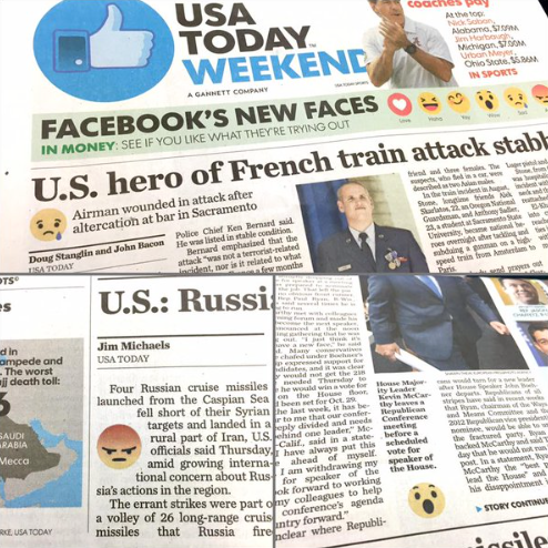
And the newspaper USA Today even included emojis to signal the tone of its stories – an experiment that has predictably been shelved.
All of this leads to horrified predictions of an illiterate, wordless future, but it’s mainly effective for its novelty value. Once someone has done an emoji-only ad, you really don’t need to do another.
Worst client of the year
The one brand that hasn’t done emojis is the Tokyo Olympics, where they would be quite appropriate. Instead, they win Worst Client of the Year for hanging their designer out to dry following pretty thin allegations of plagiarism, before launching another competition.
Fun project of the year
To prove that sports and branding can work together, this Logo Gymproject by Studio Dunbar is pretty invigorating.
Punctuation of the year
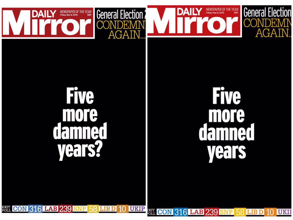
The mood of the UK election night was captured in the transition from the first edition of the Daily Mirror to the second, the last lingering hope deleted with the question mark.
Packaging copy of the year
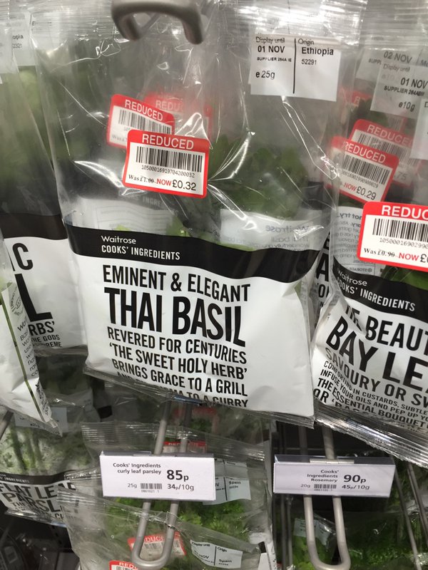
Always spoilt for choice with packaging copy. The prize has to go to Waitrose Cooks’ Ingredients. As @aljwhite pointed out, they are now starting to sound like Nicholas Witchell reporting on the Queen.
Mentions also for the most annoying bread in the world:
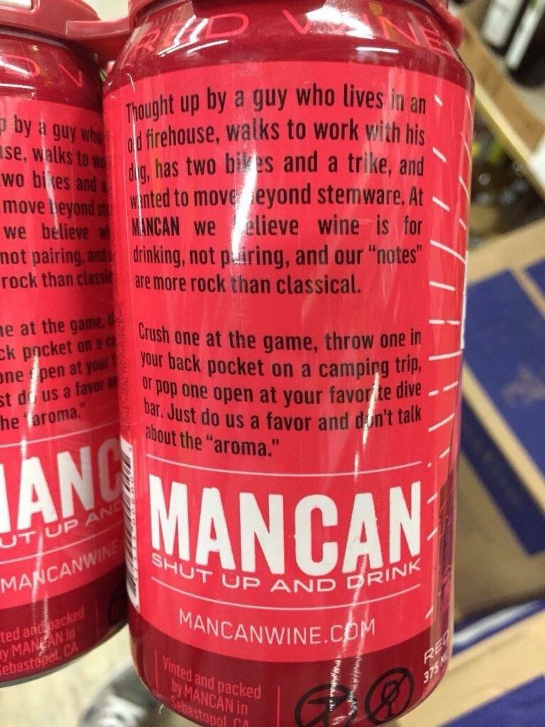
Washed down with some rugged wine (via @rhodri), which should have been called Man with a Vin.
And finally some cheese (via @betarish). I feel like I spent 11 months of this year making my way though the last line of this poem:
UI copywriting of the year
It’s not just packaging any more. One of the new frontiers for tone of voice is user interface copy. There is no error message or sign-up form that can’t be jazzed up with some chatty tone, like this error message:
Or this sign-up box:
This stuff extends to support services too. @howells tweeted this horror:
And there was a news story about Barclays threatening to give names and personalities to its new ATMs, including Sally and Jake. I’m not sure what Barclays’ demands are, but the nation will surely do anything to stop this from happening.
Worst naming project of the year
If it does happen, ATM Jake will have to compete with Storm Jake, one of a new front of branded storms that have been unleashed on the UK, following a competition by the Met Office to get the public to suggest names. To be fair, this stuff seems to be effective in raising ‘awareness’ of specific storms, which may have some public safety benefits. But you suspect it’s also about improving the Met Office’s social media metrics – metrics which it absolutely doesn’t need to have. Anyway, just like the US, we’ve gone with naming storms after people, which is simultaneously infantilising and sinister. It’s distressing enough for your house to be flooded, without it being by a storm called Phil. (Mind you, it’s better than a storm being sponsored by BMW and going on to take many lives.)
Worrying TOV development of the year
Speaking of UI copywriting, tone of voice has made its way onto road signs this year, in an experiment designed to increase public safety and reduce examples of road rage. I started and never finished a long blog post about this. The short version is I think it will briefly decrease and then steadily increase road rage.
Interesting TOV development of the year
This was also the year in which tone of voice guidelines went viral. The weird thing about the Warwick University backlash was that it’s not that extreme an example of the genre. But it doesn’t take much to produce a backlash these days.
Smart design move of the year
This was a smart way to reframe a two-star review from The Guardian.
Technology of the year
I like this story about how the humble whiteboard proved critical to negotiations with Iran.
Stupid job title of the year
Director of Modernise, Southwark Council.
Brand Darwin Awards Inaugural Winner
I wonder if there should be a Brand Darwin Awards, for brands that shoot themselves in the foot, and then the head. This year’s goes to Paypal for telling kids everywhere there’s no Santa (wrongly, because there is a Santa).
Brand psychopath of the year
I’ve argued before that brands are like psychopaths, ticking most of the boxes on the Hare PCL-R checklist. Even psychopaths deserve awards, so here goes:
The first of three winners is UBS for its grim ‘good father’ campaign (via @zarashirwan). See ‘Conning and Manipulativeness’ and ‘Shallow Affect’.
HSBC (the alleged money-laundering bank now threatening to leave the UK) ticks 'Lack of Remorse or Guilt' for advising us all to eat leftovers:
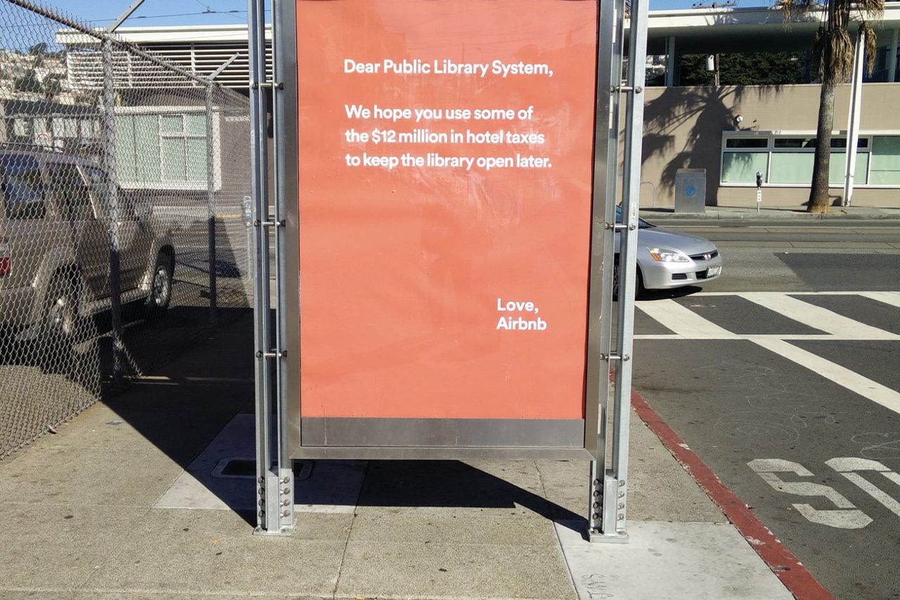
And AirBnB goes heavy on ‘Grandiose Self-Worth’ for its misjudged (and later withdrawn) hotel tax campaign, whose tone of faux-innocent entitlement is typical of too many brands today:
Two great design projects
Many more where these came from, but two that spring to mind are these ‘nostalgia for the future’ NASA posters:
And there was a particularly fine D&AD Annual cover this year by David Pearson et al.
Long copy of the year
An entire novel on a double page spread.
Short copy of the year
This obituary. You learn a lot about Doug from these two words. No nonsense, enjoyed a joke, everyone knew him. Short copy can say a lot.
Creative project of year
One of them anyway. I loved the Partick Thistle mascot by David Shrigley. A collaboration between the art world and football could have been patronising or gimmicky, but this was done in the right spirit – the mascot (Kingsley) captures the cheerful angst of watching your local team. The media tried to create a ‘backlash’ story against it, full of quotes from aghast tweeters, but most were actually joining in on the joke.
Image of the year
The most powerful image of the year was the photo of Aylan Kurdi, the Syrian boy washed up on a beach in Kos, which doesn’t need to be posted again here.
On a more surreal note, this was a real thing that happened in the UK:
Line of the year
It’s already become over-familiar after being quoted by Cameron and others, but in a year bookended by Charlie Hebdo and the Bataclan, ‘You ain’t no Muslim bruv’ was a concise and humane rebuttal of a whole narrative.
To end on a happier note:
Festive greetings to one and all. (This is a pic from last year, from Sale Appliances in Southend. Henry is one of the great underestimated brands.)
Thanks to anyone involved in all the tweets and links above – I’ve tried to cite sources where I can.
NB: If you liked 2015, you might like the prequel: Rough notes on 2014
Conversation my arse
Andrex, the toilet paper manufacturer, has recently updated its packaging and branding to incorporate its new, trademarked ‘Andrex Clean Routine’: a five-step guide for doing the one thing in life for which we all previously hoped we didn’t need a five-step guide.
On the plus side, this marks a step away from the ‘Scrunch or Fold’ campaign that saw Andrex attempting to start a national conversation around the vexed question of whether you are a ‘scruncher’ or a ‘folder’ when it comes to the one activity in life that we all previously hoped would never become the subject of a national conversation.
It’s still hard to believe the Scrunch or Fold campaign really happened, but it did. This was one of the TV ads.
It even inspired the first and only Asbury & Asbury Vine: an art house creation that I think showed promise.
Andrex has become a great case study in modern marketing, because it represents the logical outcome of two dominant trends: the mission escalation trend and the conversation trend. Both are waves of brand thinking that have swept all before them in recent years, and it’s not exactly Andrex’s fault that they have been caught up in it. It’s just that the nature of their business means stretching both trends to breaking point.
First, there’s the mission escalation trend. This is the homeopathy of marketing. It involves taking the functional purpose of any given product, diluting it to a slightly more abstract level, then diluting it again and repeating the process until you reach a level of abstraction so remote that any sense of specific purpose has been lost entirely. So if your product is a bar of chocolate, it’s not about giving people something chocolatey to eat, it’s about giving them a tasty treat. And it’s not about giving them a tasty treat, it’s about giving them a treat in a wider sense. And it’s not about the treat as such, but the enjoyment you get from that treat. And it’s not about the physical enjoyment, but the emotional enjoyment. And it’s not about the emotional enjoyment, but joy itself. And it’s not about experiencing joy, it’s about believing in joy. And now your brand purpose is more closely aligned to Buddhism than it is to chocolate.
There’s an obvious appeal in this for marketers and creatives, because it gives everyone a bigger field to play on. With a rationale like that, Cadbury’s can move away from talking about milk and cocoa and show drumming gorillas instead, because it’s all about joy. But that was a decade ago and the trend has had diminishing returns ever since. It’s the reason Burger King has ended up with ‘Be Your Way’ as a strapline: an idea so abstract that language itself no longer makes sense.
In the case of Andrex, you can see they have consciously gone through the same process – we’re not about toilet paper, we’re about Clean. We are answering one of the fundamental needs of human existence. Our mission should be to own ‘Clean’ in the same way that Google owns ‘Search’. (I’ve been in meetings like this and Google always comes up.)
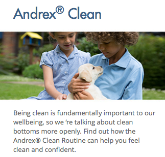
That’s what leads to this on Andrex’s website:
As an incidental point, I really wish they hadn’t put ‘bottoms’ and ‘openly’ so closely together in a sentence.
But the key part of that sentence is the word ‘so’ and what comes after it. Having established this higher purpose, we are now going to have a conversation about it.
The word ‘so’ implies some kind of causal link, but there’s no real connection. We’re going to have a conversation because that’s what brands do. Alongside mission escalation, the second big trend is Conversation.
Brands have been talking about having conversations for years, mainly since social media came along and made such a two-way exchange theoretically possible. No longer would marketing be about shouting to the masses through 48-sheets and big TV spots. Now it would be about hosting a conversation, with everyone passionately acting as your brand advocate through the simple process of joining and sharing the conversation.
Of course, nowhere on the planet has this happened. For a taste of true brand conversations, look at the Twitter feed of any major service brand – a never-ending stream of apologetic answers to customer complaints, punctuated by the odd, hopeful brand message from central marketing.
But it doesn’t stop brands trying to start a conversation, and this has clearly been the thinking at Andrex. At some point early on, someone must have said “Look, I know it’s all about conversations these days, but do we really want to have a conversation about, you know… what we do?” And after a while came the reply: “Absolutely! It’s time to do away with the embarrassment around this subject and tackle it head on! So what if it’s a bit icky? All the more reason to have the conversation! This is an opportunity not a problem!”
Except it really isn’t, for two reasons. First of all, even if you’re going to talk about it, it’s a seriously limited conversation topic. OK, it’s important to wipe properly and be clean. That’s a single message at best, not a conversation. The most gifted conversationalists of all time would struggle to make an evening out of it. Peter Ustinov would get to 30 seconds before gently steering things towards the weather.
But even if there was more to be said, it really doesn’t have to be said. Every human instinct tells us this is an unenjoyable subject to discuss. The original marketers of Andrex took this as a self-evident truth. Andrex didn’t build itself into the biggest toilet paper brand in the UK by initiating a conversation about wiping brown stains from between your cheeks. (I’m really sorry about this post.) It showed us puppies. It told charming stories that emphasised the product benefits of softness, strength and length. There was no need to go into the details of why strength was important, because we all know why strength matters in toilet tissue. No need to spell it out. Look at the nice puppy.
It’s that kind of proper, big, traditional advertising that built Andrex to the point where its marketing people can afford to sit around in meeting rooms talking about starting conversations. Strangely, you could even argue that the traditional advertising approach sparked something much closer to a genuine conversation. People still talk about the puppy today, whereas no one is having a conversation about scrunching or folding. That campaign has been and gone, remembered only in the way you can’t shake off a bad dream.
But this post isn’t really meant to be criticising Andrex. As I said earlier, they’re just following the same trends that have swept up countless other brands in recent years. Mission escalation and conversation. (You could add a third, which is infantilisation, given the way the campaign encourages us all to be more child-like in discussing these delicate matters, and adopts the voice of a boring parent trying to engage us in an awkward conversation while we wince and edge away.)
The real point of this post is that, in following these trends, Andrex usefully takes them to their logical conclusion and shows up their inherent absurdities. When a certain way of thinking about brands leads you inexorably towards Scrunch or Fold or a five-step arse-wiping programme, there is something wrong with that way of thinking about brands.
It’s a great case study in modern marketing, and one worth having a conversation about.

