Review of the Year 2017

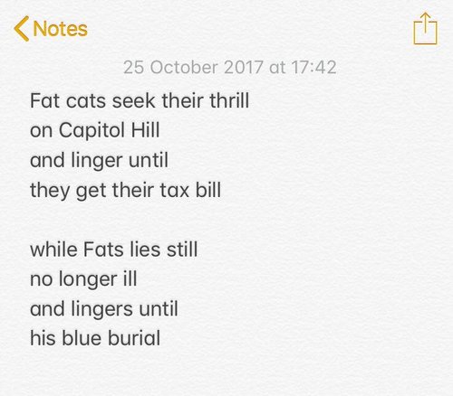
It’s been a year of words. I started off reading them, collecting snippets on a Tumblr called Reads. But since August I’ve mainly been writing them. Realtime Notes is an Instagram collection of poems about current events — I’m on poem 247 and hoping to carry on for a while.

Given that I’m effectively reviewing the year hour-by-hour on Realtime Notes, I’m not sure this Review of the Year is strictly necessary. But then again it’s important for the world to know what packaging copy I found funny this year, and there is a satisfying catharsis in writing these things — and hopefully reading them too. 

(NB: I've tried to link to all the original tweets where I've found stuff. In most cases, the links take you to the original tweet where the image was found, rather than taking you to new/extra stuff. So don't feel you have to click on everything. Yes? Does that make sense?) 

INSECURE MASCULINE BRANDING OF THE YEAR

In the year of the mainly female silence breakers (a well-handled move by Time), it’s interesting to see how brands are handling masculinity. 

Branding for men still generally takes the approach of turning oats and coconut into grenade chaos.

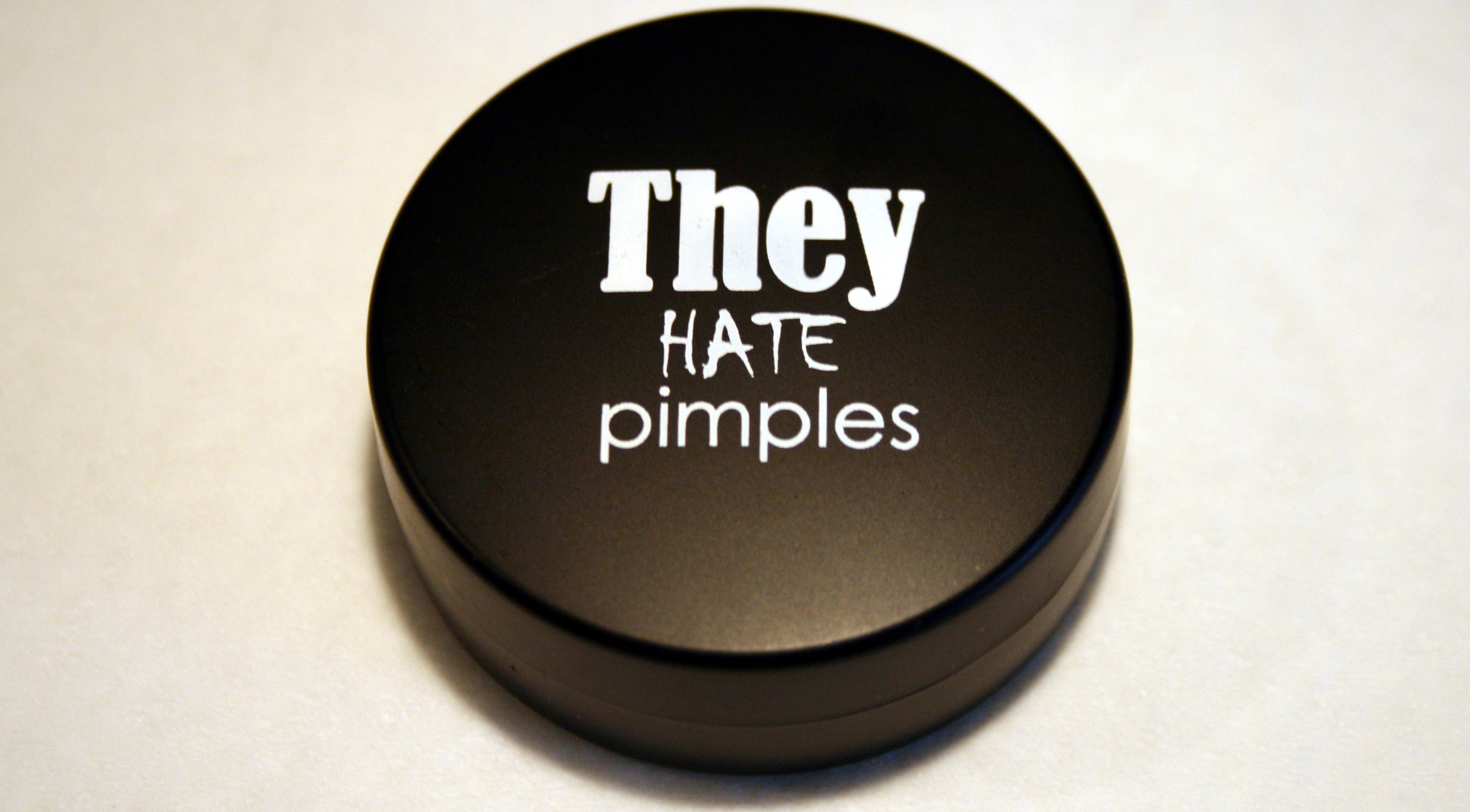
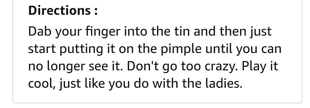
Easily the most insecure branding of the year goes to They Hate Pimples for turning a spot cream into military camouflage. (And definitely not make-up.)

Meanwhile, Tesco has read the mood and dropped the Mansize from its tissues. (I still prefer Kleenex Brand Tissues, handy for any embarrassing brand situation.)

But Three Lads are still just Three Lads.

TRUMP TROLLING OF THE YEAR
Speaking of insecure masculinity, Trump has continued to troll the world, and there have been some nice instances of the world trolling him back. 

Some good crowd size trolling here.

An excellent New Yorker cartoon.

Keeping it simple.

But the award goes to the New Sunday Herald, for this excellent TV listing.

PROTEST SIGN OF THE YEAR

On a related note, probably the most useful thing I wrote this year was an emergency guide to writing protest signs. With so much to protest about, there have been too many signs to mention. But I enjoyed the ‘Welcome to Kenya’ signs on Trump’s visit to Obama’s birthplace in Hawaii.

ADVERTISERS AGAINST TRUMP

While there has been lots of brilliantly creative popular protesting against Trump, official responses have been mixed. I wrote about the New York Times campaign and how I felt it missed the mark. The Washington Post also went arguably a bit too gothic with ‘Democracy dies in darkness’. More recently, it felt like CNN got closer to nailing it by using humour, which helps make a serious point more powerfully.

WORST AD – RUNNER-UP

The worst ad really should be Pepsi, although at least it kept us entertained.

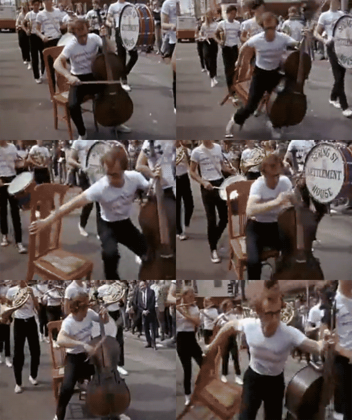
KoJDmbk - Imgur.gif

I really wanted the cellist at the beginning to join the march Woody Allen-style.

Among the duller takes were that it shows the perils of using in-house agencies (like ad agencies never do bad ads), or the ‘we’re talking about it, so it was all a cunning plan’ take (you cannot plan things this bad, and being talked about doesn’t always help your brand.)

In any case, the cultural feedback loop moment of the year came when protestors started throwing Pepsi cans at police.

WORST AD

The single worst ad of the year, for its outstandingly bleak and misanthropic use of media, is the audio ad in the Virgin Trains disabled toilet. You have no choice but to listen to it – it comes on automatically when you walk in. 

RTYflush1.jpg

This was also the year that Virgin Trains replaced this iconic piece of in-toilet copy...

rtyflush2.jpg

...with this rhyming version.

I feel like this is an improvement but, as with the French Revolution, it is probably too soon to say. 

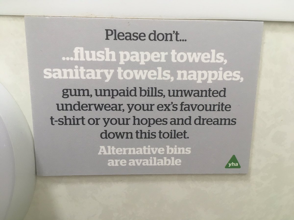
rtyflush3.jpg

To confuse things further, the YHA nicked the Virgin Trains copy, so who knows what to think any more.

BEST AD

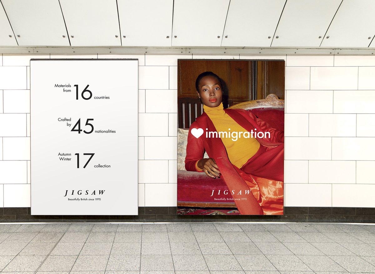
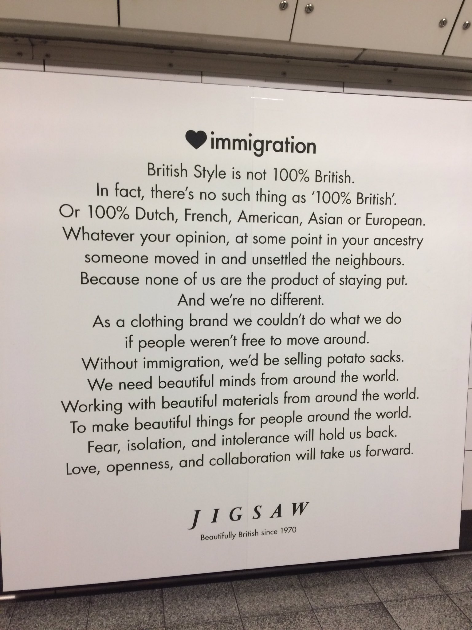
I’ve a feeling a lot of people will pick Jigsaw for their unambiguous celebration of immigation. I get uncomfortable with brands preaching politics, even if you agree with the politics – and I think the message loses impact by being too overt and preachy. However, a lot of people loved it. And I’m aware that the experience of encountering an ad in person is very different to seeing it online – I suspect it was quite moving to walk around the tube at Oxford Circus and feel the affirmative power of those ads.

On a related note, I wrote at length about brand purpose this year. While I’m sceptical about it as a core way of thinking about brands, I do think brands participate in culture and can do little things to shift norms. Casting a gay couple in an ad may seem like box-ticking, but these small acts add up to gradual normalisation – I just think they work better done quietly and modestly, rather than ‘look at us leading the revolution’.

timberland.jpg

As a response to these times, I prefer the humour of Timberland – a rare case of a brand trying to empathise with ‘millennials’ and getting it right.

BEST INFOGRAPHIC

Some quickfire ones now. Smart use of punctuation as data visualisation.

BEST DISINFOGRAPHIC

Contrast with this conspiracy infographic displayed on Fox News – like a map of its inner mind. (Both of these last ones via @michaelbierut)

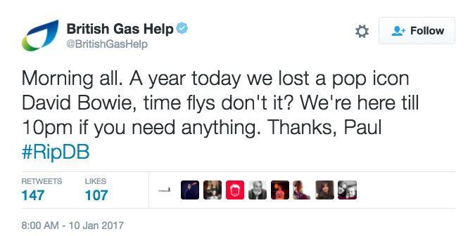
WORST BRAND TWEET

britishgas.png

An argument for using bots instead of humans to write tweets.

BEST BRAND TWEET

Also an argument for using bots instead of humans to write tweets. 

WORDPLAY OF THE YEAR

As with everything on the Internet these days, it’s hard to know if Photoshop was involved.* But I was impressed by this ‘found’ version of Wonderwall by @thepunningman.

* I can now confirm no Photoshop was involved. Hooray, some things are real.

PACKAGING COPY OF THE YEAR

RTYchocolate.jpg

OK, packaging copy. As usual, there was some heroic padding going on.

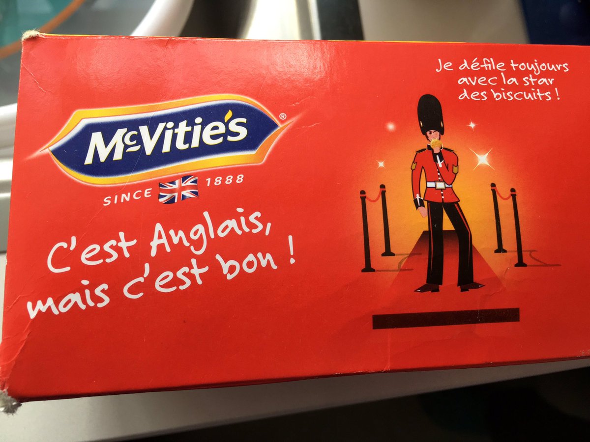
mcvities.jpg

And the saboteurs at McVitie’s casually dropped a line that translates as ‘It’s English but it’s good’.

RTYbuttercode.jpg

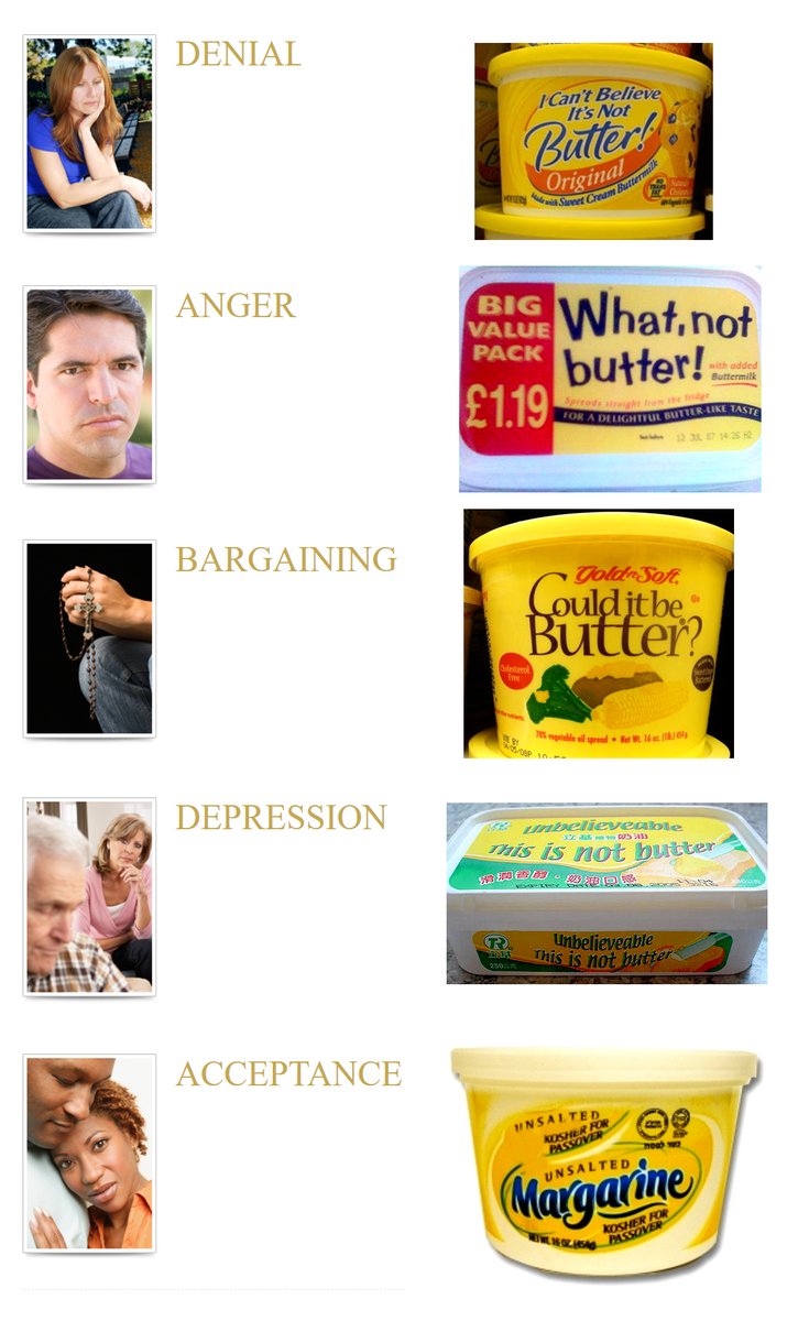
But this was mainly the year of funny tweets about packaging. Firstly, someone cracked the butter code.

Screen Shot 2017-12-11 at 13.39.25.png

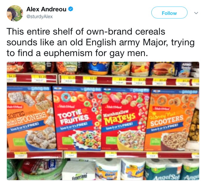
And Alex Andreou realised what’s really going on with cereals.

But this Apple Juice observation was my favourite — go here to retweet it.

SLOGAN OF THE YEAR

beanz1.jpg

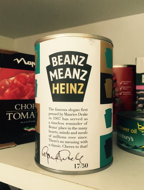
This was the year that Beanz Meanz Heinz turned 50 and was celebrated in an exhibition at Selfridge’s. I believe the correct hashtag is #copywritergoals

We also witnessed a slogan occurring to Donald Trump in real time.

prongles-hed-2017.jpg

Cards Against Humanity refocused their energies on Prongles – a real, unauthorised and widely distributed pastiche of Pringles. It was a convoluted joke and the target wasn’t especially clear. But the best thing about it was the slogan.

And in a new twist on slogans, probably my favourite of the year was Yes good by Emerald Nuts, taken from a real customer review on Amazon.

BEST COPY EDITING

Two winners here: Chuck Schumer for this letter about Senate oversight of Presidential nominations, in which he took a letter from Mitch McConnell (written in different political times) and sent it back to him. 

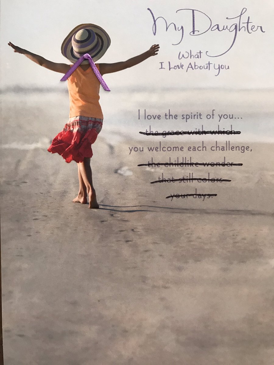
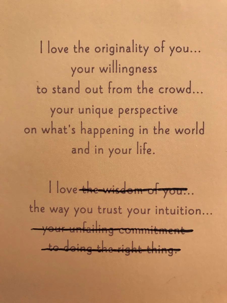
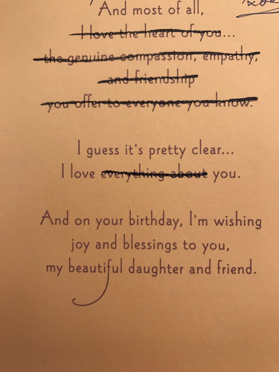
The other winner is this person’s dad for a brilliantly pedantic birthday card strategy in which he crosses out the bits that don’t apply. 

‘DESIGN FOR GOOD’ PROJECT OF THE YEAR

Here’s an example of a ‘design for good’ project without a fanfare, hashtag, case study video with Sigur Ros soundtrack, or story six months later about how it was all a scam.

TWITTER MOMENT OF THE YEAR

trumpexist.jpg

This was the year that Twitter moved to 280 characters, which turned out not to matter very much. Probably the best moment was when Trump ceased to exist...

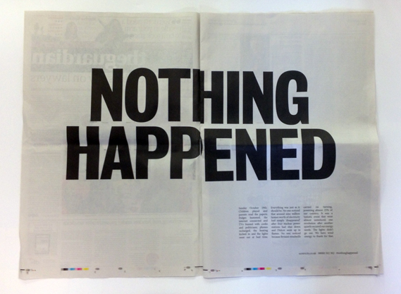
... which had parallels with the silent News at Ten, probably the most eloquent commentary on 2017 that there has been.

ALL ABOUT ME

My personal highlight was the release of Sideways Dictionary, an online dictionary of analogies for technological terms, created in partnership with Jigsaw and the Washington Post – one of the most enjoyable and mind-bending things I’ve written.

Also, this year saw an updated version of Perpetual Disappointments Diary come out with Pan Macmillan, and a new version in the US with Chronicle Books. (Pic by @lettemoore)

And I briefly went viral with a piece for McSweeney’s and Louis Theroux said he loved it.

WISH FOR 2018

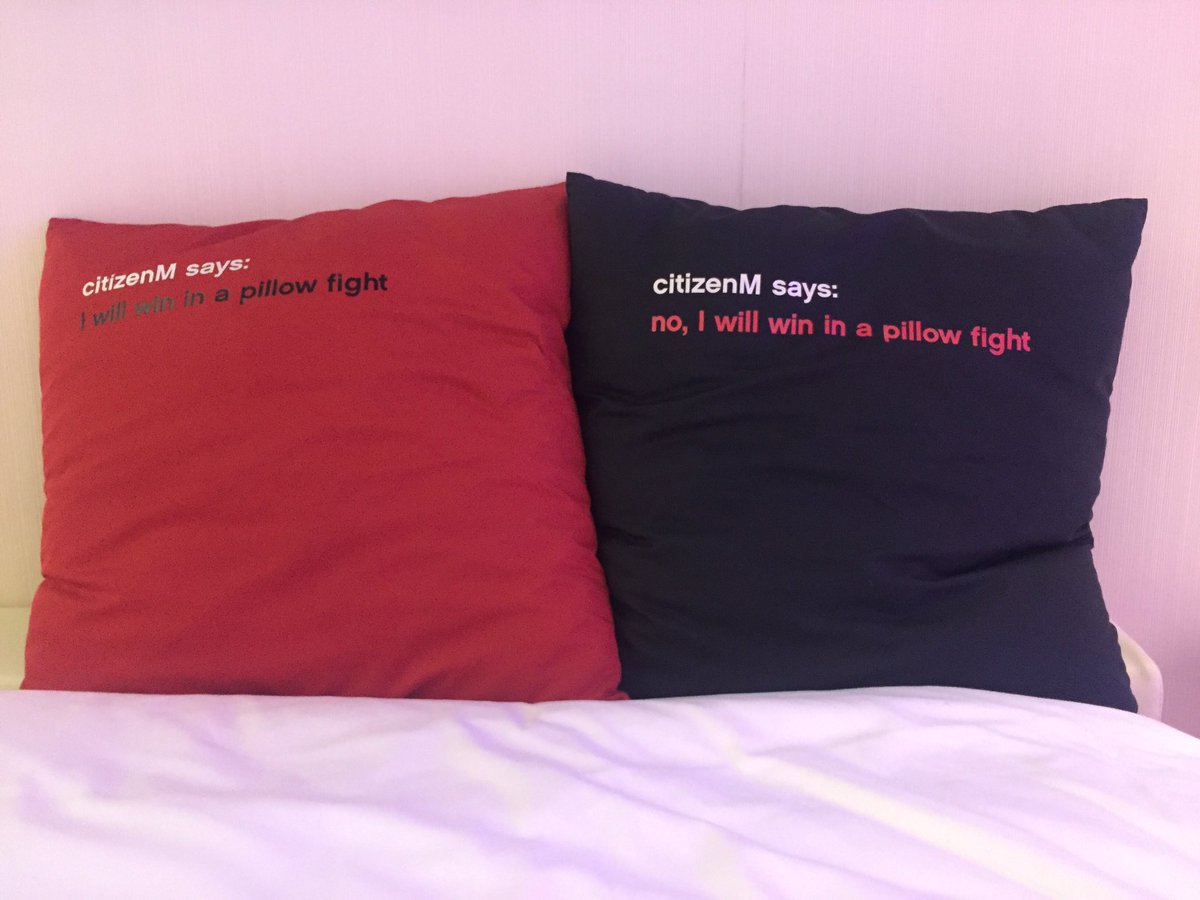
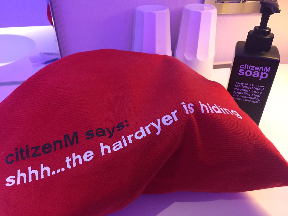
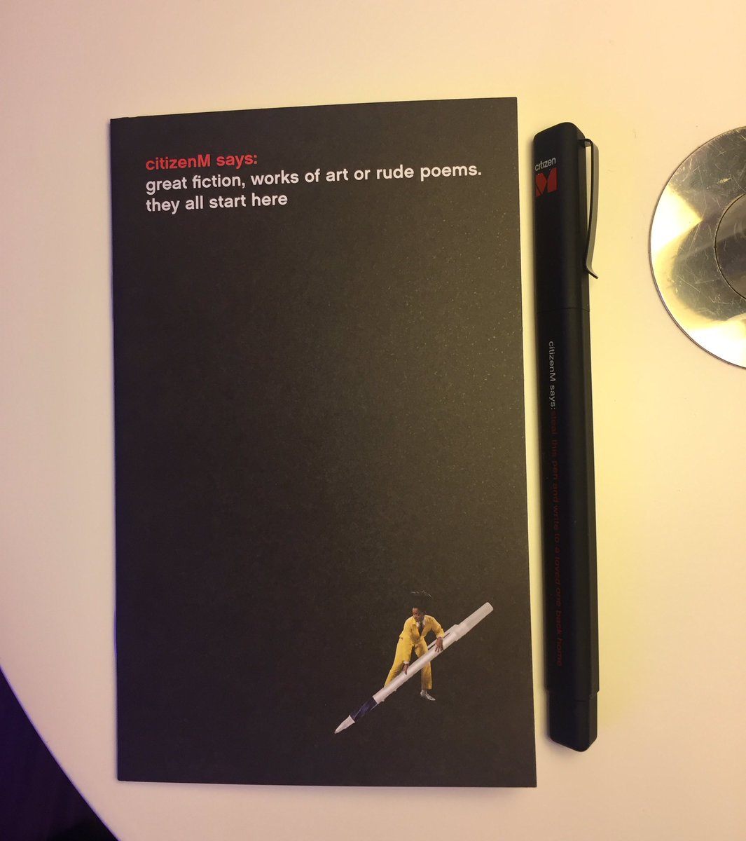
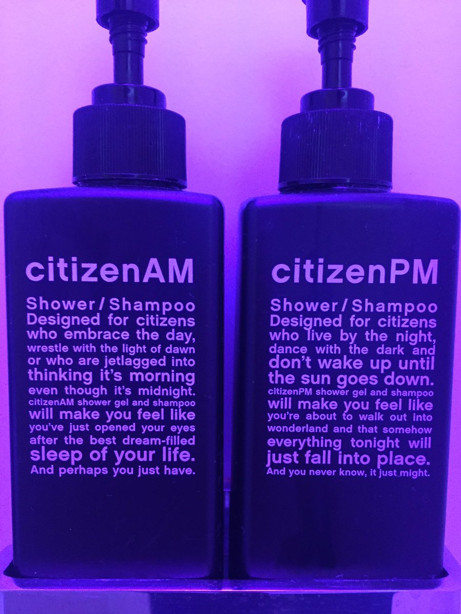
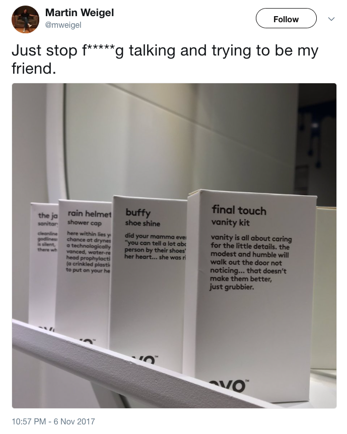
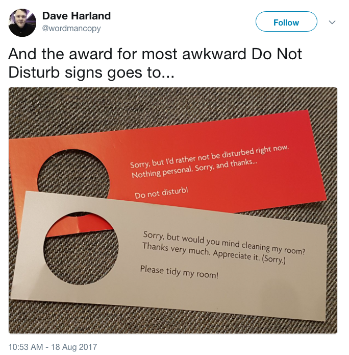
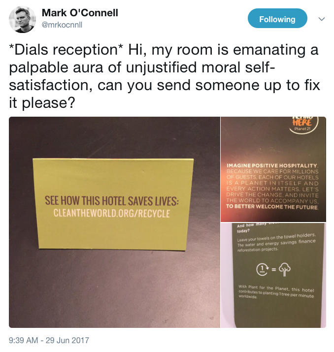
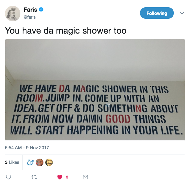
My wish for 2018 is for hotels to introduce tone-of-voice-free rooms. Over the summer, I stayed in a Citizen M hotel, which was great except for the cacophony of copywriting (all of which looks nice as individual executions on a screen, but less so when it’s combined into one room where you have to live and sleep).

I’ve collected a few other examples (scroll through above).

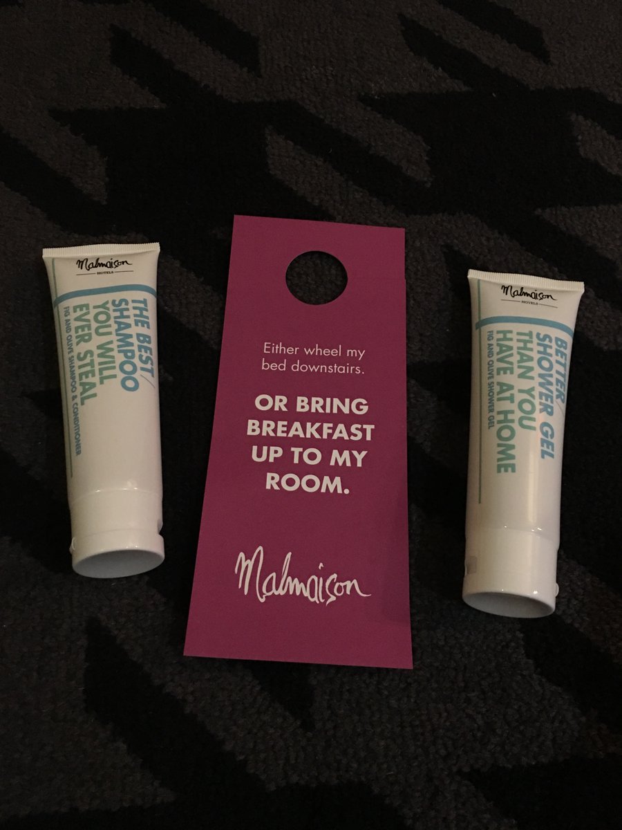
malmaison.jpg

To be fair, Malmaison is quite funny. But it takes a very funny joke to be funny the eighth time you read it.

THOSE WE LOST

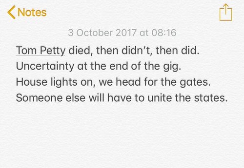
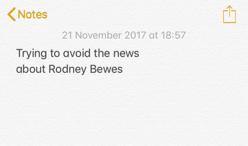
Lots of people have sadly gone, some of them memorialised in Realtime Notes above.

And not forgetting Brenda Webb, who fell to Cher.

LINE OF THE YEAR

Not sure who came up with ‘The rest is science’, but it was a moment of genius. A reworking of the most beautiful dying words in literature (Hamlet’s ‘The rest is silence’) to mark the passing of a great scientific expedition. 

IMAGE OF THE YEAR

Trump before the Last Judgment. Although maybe it’s the image of next year. (Photo by @oss_romano)

That was quite a long review, wasn’t it?

Review of the year 2016

On a dark and stormy night in southern England, you find yourself wandering through a faded seaside town. It's past closing time. You walk towards the empty pier and gaze out to sea. Somewhere in the vast blackness lies Europe. Then a movement in the waves. You hear screams. Two figures are struggling, naked and shouting. Migrants? It can’t be. You rush to the shore to help. As the foam sloshes round your ankles, you see the figures emerging. They are old, fat, blotchy, swaying. There's a stench of bitter and Benson & Hedges. A flash of lightning and you recognise the faces. It’s Nigel Farage and Arron Banks, the millionaire founder of Leave.EU, celebrating Nigel’s last day as UKIP leader by skinny-dipping drunkenly off Bournemouth pier. You run, stumble and scramble your way back up the beach, the two figures behind you, laughing maniacally as the waves crash and the thunder roars.

Thanks for everything, 2016.

The sooner we review it, the sooner we can move on. So here is my usual list of arbitrary awards, mostly to do with branding, writing and design.

WORST BRAND LINE

Be Legacy. A line that set off a chain of events including the Brand Line Surgery, the taglin3r slogan generator and our Slogan Cube.

BEST BRAND LINE

The runner-up is the new line for Nationwide Building Society – 'Building society, nationwide' – a smart, economical line, allied to a decent ad campaign using performance poets, in not too pretentious a way. All nicely done, but it could never quite shake off the feeling of being a brand exercise. 

The winner is Liberté Egalité Footé. A genius line for the BBC's Euro 2016 coverage – much better than the team bus slogans.

BEST POLITICAL CAMPAIGN

The Hillary campaign was excellent. Clear-headed branding by Michael Bierut, that stayed fresh throughout a long campaign...

...alongside powerful advertising by Droga5 (criticised at the time for appealing to the base, but people say she lost by not getting the base out enough)...

...and even the social media team was sharp. The mannequin challenge video on the last day of campaigning has now taken on a haunting quality – a moment frozen in time, just before the world fell apart. (And we all blame Jon Bon Jovi.)

It was an expertly coordinated campaign, and it can't exactly be labelled a disaster when Clinton won the popular vote. But it did ultimately fail. It's hard to fight your way out of a narrative of authentic (Trump) versus establishment (Clinton), where every horrendous aberration by Trump somehow confirms 'authentic' and every professional response by Clinton confirms 'establishment'.

But it was still the best campaign. 

WORST POLITICAL CAMPAIGN

This year should have been, but probably won't be, a tipping point for political advertising. Political parties have always pushed the limits of the truth in campaign advertising, but in a normal election there is at least a built-in check – the party that wins can be held to its promises, or slated for breaking them. In a referendum, that doesn't apply. The more extreme Brexit campaigners could promise anything, because they wouldn't be accountable for delivering it. Who knows how many votes were won by the £350m/week NHS promise? Who knows what synapse was triggered in the brain of a lonely psycho in Yorkshire by that 'Breaking point' poster?

In retrospect, Labour carving its promises in stone doesn't seem so crazy now. What will parties do to convince voters to believe them next time?

WRITING ANTI-HERO OF THE YEAR

A special mention for Harold BernsteinDonald Trump's doctor, who rattled off a report on Trump's 'astonishingly excellent' health in five minutes as a limo waited outside. 

But the winner is Tony Schwarz, Donald Trump's guilt-wracked former ghostwriter, who took the money and created a monster.

WRITING HERO OF THE YEAR

Copywriters and proofreaders everywhere salute the hyphen-carrier at Euro 2016. (Fans of kerning were less impressed.)

WORST COPY

This found cat notice is very 2016. As writer @tomcopy noted, 'When imparting bad news, say the worst thing first'. 

WORD OF THE YEAR

Three runners-up here:

Brexit was a much-used word, but as it only 'means Brexit', it's not much use as a word. (The pic above was my attempt to write a Brexit Dictionary.)

Post-truth was the Oxford Dictionaries Word of the Year, but it feels like defeatism to me. Lies and appeals to emotion are nothing new, and the truth is what it always was. Try telling the Hillsborough campaigners that we're 'post-truth'. (Theirs was a rare good news story this year, albeit not a news story covered by some newspapers.) 

I quite liked my own coinage – necrofiller – to describe the fetish for announcing any given trend 'is dead' in order to generate easy column inches. Kevin Roberts has used necrofiller for years and eventually met his end when he announced that gender bias in the ad industry is 'all over'. 

But the winner this year is 'ironicidal', a coinage by columnist Marina Hyde, meaning 'irony-killing'. We have needed that word a lot this year. 

BEST VIRAL

Not a viral for anything in particular, but a lovely video of life's unsatisfying moments, by Parallel Studio. I wish it had been a promo for Perpetual Disappointments Diary – it wasn't, but this is my chance to plug it.

BEST LOGO

This is great static and even better in motion – by @desandro for RGB Schemes, a VR games start-up. More details here (spotted via @alex_parrott).

BEST AD CAMPAIGN

Not many spring to mind this year – the Christmas ads in particular struggled to bear the weight of the hype that surrounds them. John Lewis was more evidence of the great unspoken truth in advertising – it's basically about doing anthropomorphic animals. (On the plus side, it's worth noting that the Co-op has quietly cracked Christmas by waiting until it's December and all the PR noise has died down, then doing something normal and useful.) 

More generally, this recent IKEA campaign stands out – renaming products after popular Google searches to increase traffic and reflect a product truth (IKEA solves everyday problems, and has always had weird product names anyway). More on Creative Review

BLEAKEST MOMENT IN ADVERTISING

Scam awards entries have been around for a while, but has it ever been worse than this year? As hundreds of migrants lost their lives in the Mediterranean, champagne-quaffing crowds on the shores of the same sea at Cannes handed an award to an app that supposedly crowdsourced the search for capsized migrant boats, but which (under the slightest scrutiny) turned out to be a paper-thin, unworkable ‘proof of concept’ that wasn’t acknowledged as such in the entry, or tested in any way by the judges or awards organisers. The agency involved eventually withdrew the work with a sniffy non-apology, casting itself as the victim of online harassment (otherwise known as 'someone writing honestly about what you did').

The bigger point is that, if awards shows are serious about awarding social good, they need a different and more rigorous judging process – not just a procession of case study videos with no context or analysis. 

BEST PACKAGING COPY

In previous editions, this Review of the Year has had plenty of fun with bad packaging copy, so let's celebrate a good one for a change. 'Deliciously squidgy energy' is a magical line. It combines three benefits – taste, texture and nutritional value – in one evocative phrase that sounds like something NASA has just discovered. Yes, 'squidgy' is one of those infantilising, wackaging-y words, but it's justified in this case. Good work, Soreen.

WORST PACKAGING COPY

That said, let's have some fun with bad packaging copy. 

First, this water is definitely from the tap, isn't it? (via @jntod)

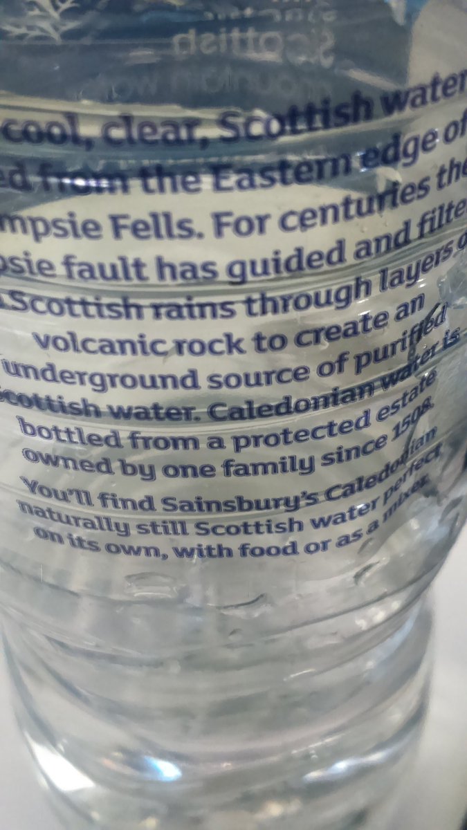
... while this upmarket water is ideal 'on its own, with food or as a mixer' (via @madsyork). This reminds me of the heroic filler copy for IKEA curtains from 2014.

These fruit-flavoured milks have been the subject of several restraining orders (via @mangmangmang).

But the most punchable line in packaging goes to Dorset Cereals, for this 'Design a typeface' moment. Why do makers of cereals, yoghurts etc take it upon themselves to be our crap life-coaching gurus? And why don't they do the obvious thing and give us something interesting to read with our breakfast?

MOST CONFUSING COPY

When your pharmacist actually wants you to die (via @dochackenbush)

RENAMING OF THE YEAR

This was an interesting year for Budweiser to rebrand as America.

The full label reads like a bleak work of art, maybe a Banksy.

On a lighter renaming note, this was also the year when Sam Allardyce, during his brief reign as England manager, found time to rename the office WiFi network 'Big Sam's Office'. 

WORST BRAND STUNT

The Greggs Nappucino zone. Because there's nothing more conducive to sleep than downing a cheap coffee before shutting yourself inside a giant Greggs coffee cup with a glass door, in the middle of one of London’s busiest tourist locations.

PASSIVE-AGGRESSIVE MICROCOPY OF THE YEAR

There's a growing trend for passive-aggressive 'No thanks' options that you have to click to close annoying pop-up ads. Julia Phillips has listed 35 of them here (spotted via @ArwaM). Here's the top ten – it reads as a healthy list of life goals.

TREND OF THE YEAR

Chatbots are the main obsession of brands right now, and that will probably continue into next year. There are some interesting possibilities, but as Tom Goodwin pointed out on Twitter: "We desperately hope that 'people want conversations with brands' and then the fragile, rare moments they do, we're going to pass them onto a bot?"

Earlier in the year, I wrote about bots and copywriting, and did an interview on the same subject with Creative Review. I also created @botconference, which tweets quotes from an imaginary conference – it's been good fun watching it unfold over the year.  

Tangentially related, I enjoyed this story about a grandmother typing 'please' and 'thank you' every time she uses Google. It reverses the polarities of the usual chatbot dynamic. While bots do their best to appear human, humans have mostly learned to talk like robots – we instinctively search Google using the minimum viable words and phrases that we know will work within the algorithm. I'm not sure we want or need a conversational interface, but it seems we're going to get one anyway.  

POOR BRANDING DECISION OF THE YEAR

Yeah, no. (via @marketinguk)

SADDEST BRAND TWEET

This Sure Deodorant Twitter poll closed two days after opening, without a single vote cast (via @oliverburkeman). I think the second option is meant to read 'Time with a friend', but it doesn't really matter. 

MOST BRITISH MOMENT

David Cameron’s goodbye hum. Some theorised it was the West Wing theme tune, others reimagined it as the evil Tory theme tune

Also on a musical theme, the BBC briefly found its mojo with this Newsnight play-out. 

PROJECT OF THE YEAR

somme_station.jpg

'We’re here because we’re here' by Jeremy Deller was a stunning commemoration of the Battle of the Somme. With no prior publicity, groups of volunteers in uniform ghosted their way into locations across the UK – stations, shopping centres, tube carriages – and sat quietly, or occasionally bursting into song. When approached by a member of the public, each volunteer would hand out a card, with the name of a soldier who gave his life in battle. No technology, no gimmicks, no preaching, but a reminder that, for all the 'worst year ever' talk, 2016 wasn't as bad as 1916. 

DESIGN OF THE YEAR

The year began with the release of Black Star by David Bowie, which foreshadowed the most graceful exit from life any artist has managed. Jonathan Barnbrook's artwork was a key part of it, a monumental expression of absence and a case study in the primal power of graphic symbols. 

In a poetic touch, the album sleeve revealed a glittering starscape when exposed to sunlight.

There were too many other exits to mention this year. But as valedictions go, Garry Shandling's last appearance with friend Jerry Seinfeld was pretty good too. 

CLOSING THOUGHT OF THE YEAR

There’s no cheerful note to end on. It’s been a dark year. But to close on something seasonal and thematically appropriate, here's a study showing every teardrop is unique, just like snowflakes. 

Happy Christmas. 

Review of the year 2015

‘Review of the year’ is a grand title for what is mainly a review of things I’ve tweeted / favourited (now ‘liked’) over the last year. I’ve also been less active than usual online, so this will miss out a lot of things. But apart from that, here is my comprehensive and authoritative review of the year.
 

Best brand conversation

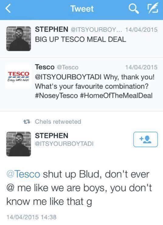
Brands having conversations are like people pretending to be on the phone. You chat away, nodding and chuckling at imagined jokes – but then the phone rings and everyone laughs and points at you. For a brand, there’s nothing more disconcerting than when a real person answers back. Tesco wins the best brand conversation award for the Twitter exchange above, closely followed by this one:

Worst brand conversation
This was the year that Andrex launched a five-step guide to wiping your backside and asked us all to have a conversation about it. I wrote about it here: Conversation my arse
 

Trend of the year (runner-up)

Brands doing feminism and getting it wrong. Sometimes it’s obvious and almost endearingly cack-handed, like Bic Pens celebrating International Women’s Day, or the recent IBM #hackahairdryercampaign. Other stuff gets celebrated widely, but is arguably worse. This Mindy Kaling article (last few paras) should be required reading for the Always and Dove marketing teams, who confidently tell the rest of the world how to do feminism, with the passion of a recent convert.
 

Non-trend of the year (winner)

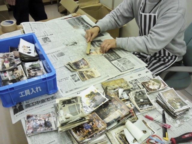
Non-trend, because it’s not something that happens much or gets shouted about. But there are examples of brands doing serious social good, without making a song and dance about it. This Ricoh Save The Memory project is a painstaking, years-long, open-source effort to rescue thousands of photographs lost and damaged in the Japanese tsunami of 2011. It’s properly useful, but it’s hard work.
 

Trend of the year (winner)

This probably has to be emojis. I don’t actually mind emojis – they’re fun. What grates is the media consensus that any project or press release that contains the word ‘emoji’ is now automatically and hilariously innovative and ‘now’. (Before this, it was ‘selfie’, which still retains some of its talismanic power, although it’s starting to wear off.)

So Domino’s wins accolades for ordering a pizza by emoji. Dove solves everything by releasing curly-haired emojis. McDonald’s upsets copywriters everywhere with an emoji-only ad (above – the last emoji was added by a member of the public).

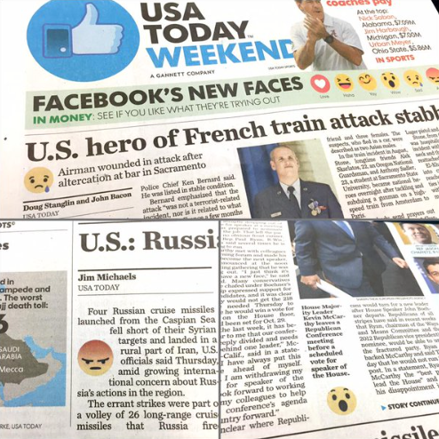
And the newspaper USA Today even included emojis to signal the tone of its stories – an experiment that has predictably been shelved.

All of this leads to horrified predictions of an illiterate, wordless future, but it’s mainly effective for its novelty value. Once someone has done an emoji-only ad, you really don’t need to do another. 
 

Worst client of the year

The one brand that hasn’t done emojis is the Tokyo Olympics, where they would be quite appropriate. Instead, they win Worst Client of the Year for hanging their designer out to dry following pretty thin allegations of plagiarism, before launching another competition.
 

Fun project of the year

To prove that sports and branding can work together, this Logo Gymproject by Studio Dunbar is pretty invigorating.
 

Punctuation of the year

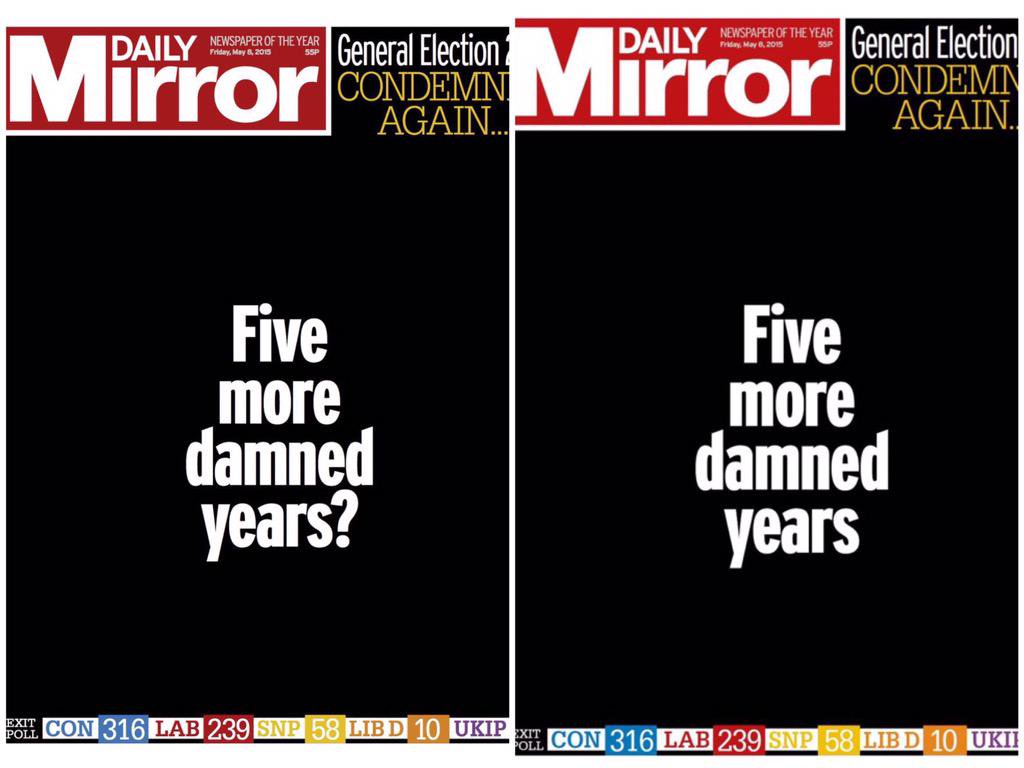
The mood of the UK election night was captured in the transition from the first edition of the Daily Mirror to the second, the last lingering hope deleted with the question mark.
 

Packaging copy of the year

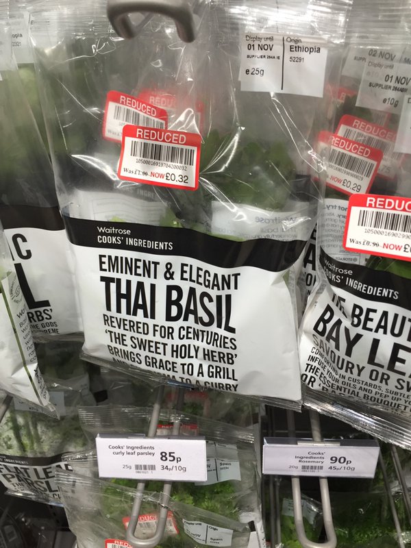
Always spoilt for choice with packaging copy. The prize has to go to Waitrose Cooks’ Ingredients. As @aljwhite pointed out, they are now starting to sound like Nicholas Witchell reporting on the Queen.

Mentions also for the most annoying bread in the world:

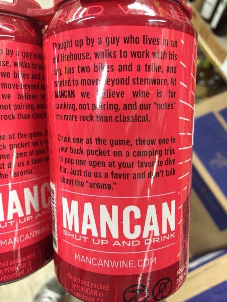
Washed down with some rugged wine (via @rhodri), which should have been called Man with a Vin.

And finally some cheese (via @betarish). I feel like I spent 11 months of this year making my way though the last line of this poem:

UI copywriting of the year

It’s not just packaging any more. One of the new frontiers for tone of voice is user interface copy. There is no error message or sign-up form that can’t be jazzed up with some chatty tone, like this error message:

Or this sign-up box:

This stuff extends to support services too. @howells tweeted this horror:

And there was a news story about Barclays threatening to give names and personalities to its new ATMs, including Sally and Jake. I’m not sure what Barclays’ demands are, but the nation will surely do anything to stop this from happening.
 

Worst naming project of the year

If it does happen, ATM Jake will have to compete with Storm Jake, one of a new front of branded storms that have been unleashed on the UK, following a competition by the Met Office to get the public to suggest names. To be fair, this stuff seems to be effective in raising ‘awareness’ of specific storms, which may have some public safety benefits. But you suspect it’s also about improving the Met Office’s social media metrics – metrics which it absolutely doesn’t need to have. Anyway, just like the US, we’ve gone with naming storms after people, which is simultaneously infantilising and sinister. It’s distressing enough for your house to be flooded, without it being by a storm called Phil. (Mind you, it’s better than a storm being sponsored by BMW and going on to take many lives.)
 

Worrying TOV development of the year

Speaking of UI copywriting, tone of voice has made its way onto road signs this year, in an experiment designed to increase public safety and reduce examples of road rage. I started and never finished a long blog post about this. The short version is I think it will briefly decrease and then steadily increase road rage.
 

Interesting TOV development of the year


This was also the year in which tone of voice guidelines went viral. The weird thing about the Warwick University backlash was that it’s not that extreme an example of the genre. But it doesn’t take much to produce a backlash these days.
 

Smart design move of the year

This was a smart way to reframe a two-star review from The Guardian.
 

Technology of the year

I like this story about how the humble whiteboard proved critical to negotiations with Iran.
 

Stupid job title of the year

Director of Modernise, Southwark Council.
 

Brand Darwin Awards Inaugural Winner

I wonder if there should be a Brand Darwin Awards, for brands that shoot themselves in the foot, and then the head. This year’s goes to Paypal for telling kids everywhere there’s no Santa (wrongly, because there is a Santa).
 

Brand psychopath of the year

I’ve argued before that brands are like psychopaths, ticking most of the boxes on the Hare PCL-R checklist. Even psychopaths deserve awards, so here goes:

The first of three winners is UBS for its grim ‘good father’ campaign (via @zarashirwan). See ‘Conning and Manipulativeness’ and ‘Shallow Affect’.

HSBC (the alleged money-laundering bank now threatening to leave the UK) ticks 'Lack of Remorse or Guilt' for advising us all to eat leftovers:

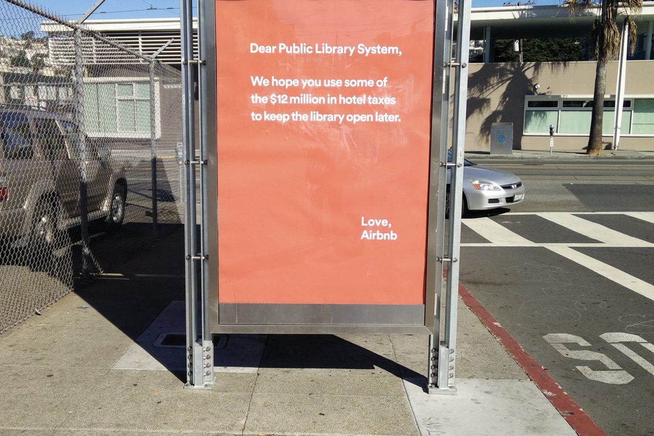
And AirBnB goes heavy on ‘Grandiose Self-Worth’ for its misjudged (and later withdrawn) hotel tax campaign, whose tone of faux-innocent entitlement is typical of too many brands today:

Two great design projects

Many more where these came from, but two that spring to mind are these ‘nostalgia for the future’ NASA posters:

And there was a particularly fine D&AD Annual cover this year by David Pearson et al.

Long copy of the year

An entire novel on a double page spread.
 

Short copy of the year

This obituary. You learn a lot about Doug from these two words. No nonsense, enjoyed a joke, everyone knew him. Short copy can say a lot.


Creative project of year

One of them anyway. I loved the Partick Thistle mascot by David Shrigley. A collaboration between the art world and football could have been patronising or gimmicky, but this was done in the right spirit – the mascot (Kingsley) captures the cheerful angst of watching your local team. The media tried to create a ‘backlash’ story against it, full of quotes from aghast tweeters, but most were actually joining in on the joke. 
 

Image of the year

The most powerful image of the year was the photo of Aylan Kurdi, the Syrian boy washed up on a beach in Kos, which doesn’t need to be posted again here.

On a more surreal note, this was a real thing that happened in the UK:

Line of the year

It’s already become over-familiar after being quoted by Cameron and others, but in a year bookended by Charlie Hebdo and the Bataclan, ‘You ain’t no Muslim bruv’ was a concise and humane rebuttal of a whole narrative.

To end on a happier note: 

Festive greetings to one and all. (This is a pic from last year, from Sale Appliances in Southend. Henry is one of the great underestimated brands.)

Thanks to anyone involved in all the tweets and links above – I’ve tried to cite sources where I can.

NB: If you liked 2015, you might like the prequel: Rough notes on 2014