Review of the Year 2017

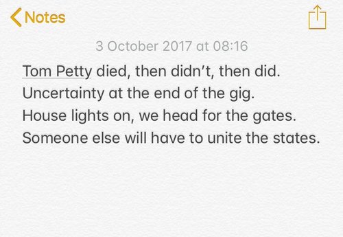
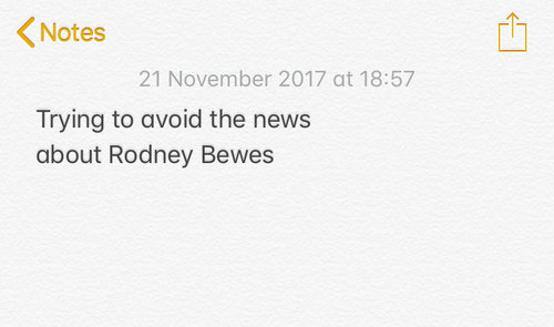
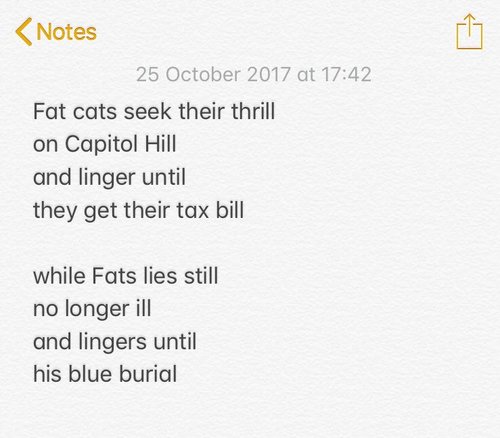
It’s been a year of words. I started off reading them, collecting snippets on a Tumblr called Reads. But since August I’ve mainly been writing them. Realtime Notes is an Instagram collection of poems about current events — I’m on poem 247 and hoping to carry on for a while.

Given that I’m effectively reviewing the year hour-by-hour on Realtime Notes, I’m not sure this Review of the Year is strictly necessary. But then again it’s important for the world to know what packaging copy I found funny this year, and there is a satisfying catharsis in writing these things — and hopefully reading them too. 

(NB: I've tried to link to all the original tweets where I've found stuff. In most cases, the links take you to the original tweet where the image was found, rather than taking you to new/extra stuff. So don't feel you have to click on everything. Yes? Does that make sense?) 

INSECURE MASCULINE BRANDING OF THE YEAR

In the year of the mainly female silence breakers (a well-handled move by Time), it’s interesting to see how brands are handling masculinity. 

Branding for men still generally takes the approach of turning oats and coconut into grenade chaos.

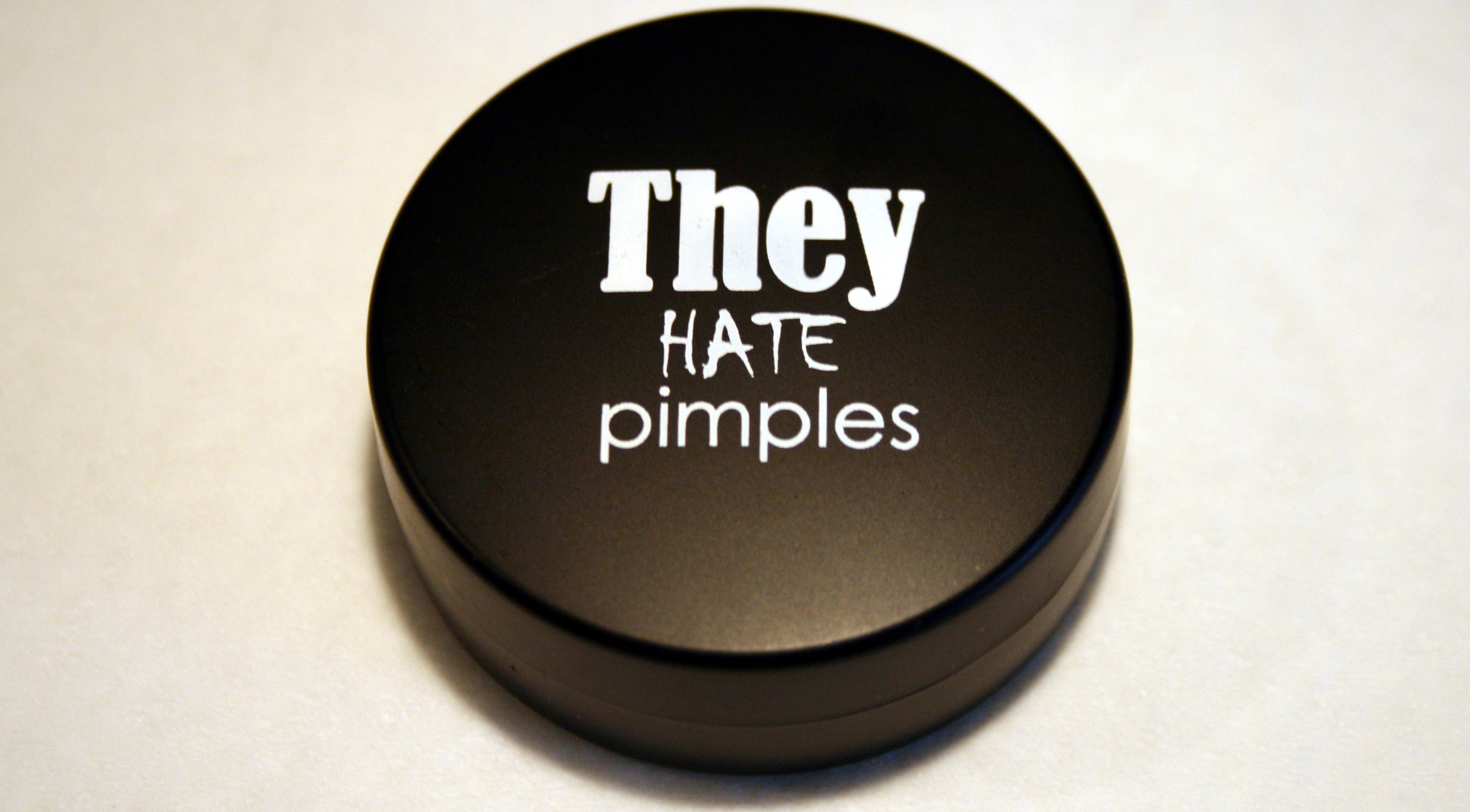
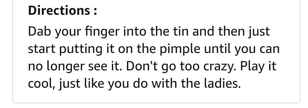
Easily the most insecure branding of the year goes to They Hate Pimples for turning a spot cream into military camouflage. (And definitely not make-up.)

Meanwhile, Tesco has read the mood and dropped the Mansize from its tissues. (I still prefer Kleenex Brand Tissues, handy for any embarrassing brand situation.)

But Three Lads are still just Three Lads.

TRUMP TROLLING OF THE YEAR
Speaking of insecure masculinity, Trump has continued to troll the world, and there have been some nice instances of the world trolling him back. 

Some good crowd size trolling here.

An excellent New Yorker cartoon.

Keeping it simple.

But the award goes to the New Sunday Herald, for this excellent TV listing.

PROTEST SIGN OF THE YEAR

On a related note, probably the most useful thing I wrote this year was an emergency guide to writing protest signs. With so much to protest about, there have been too many signs to mention. But I enjoyed the ‘Welcome to Kenya’ signs on Trump’s visit to Obama’s birthplace in Hawaii.

ADVERTISERS AGAINST TRUMP

While there has been lots of brilliantly creative popular protesting against Trump, official responses have been mixed. I wrote about the New York Times campaign and how I felt it missed the mark. The Washington Post also went arguably a bit too gothic with ‘Democracy dies in darkness’. More recently, it felt like CNN got closer to nailing it by using humour, which helps make a serious point more powerfully.

WORST AD – RUNNER-UP

The worst ad really should be Pepsi, although at least it kept us entertained.

KoJDmbk - Imgur.gif

I really wanted the cellist at the beginning to join the march Woody Allen-style.

Among the duller takes were that it shows the perils of using in-house agencies (like ad agencies never do bad ads), or the ‘we’re talking about it, so it was all a cunning plan’ take (you cannot plan things this bad, and being talked about doesn’t always help your brand.)

In any case, the cultural feedback loop moment of the year came when protestors started throwing Pepsi cans at police.

WORST AD

The single worst ad of the year, for its outstandingly bleak and misanthropic use of media, is the audio ad in the Virgin Trains disabled toilet. You have no choice but to listen to it – it comes on automatically when you walk in. 

RTYflush1.jpg

This was also the year that Virgin Trains replaced this iconic piece of in-toilet copy...

rtyflush2.jpg

...with this rhyming version.

I feel like this is an improvement but, as with the French Revolution, it is probably too soon to say. 

rtyflush3.jpg

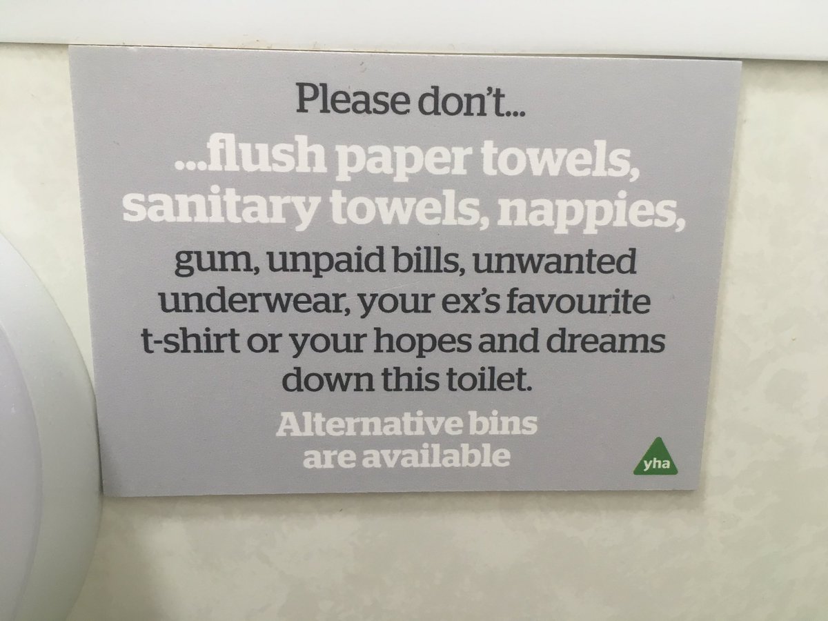
To confuse things further, the YHA nicked the Virgin Trains copy, so who knows what to think any more.

BEST AD

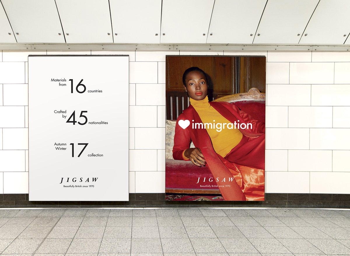
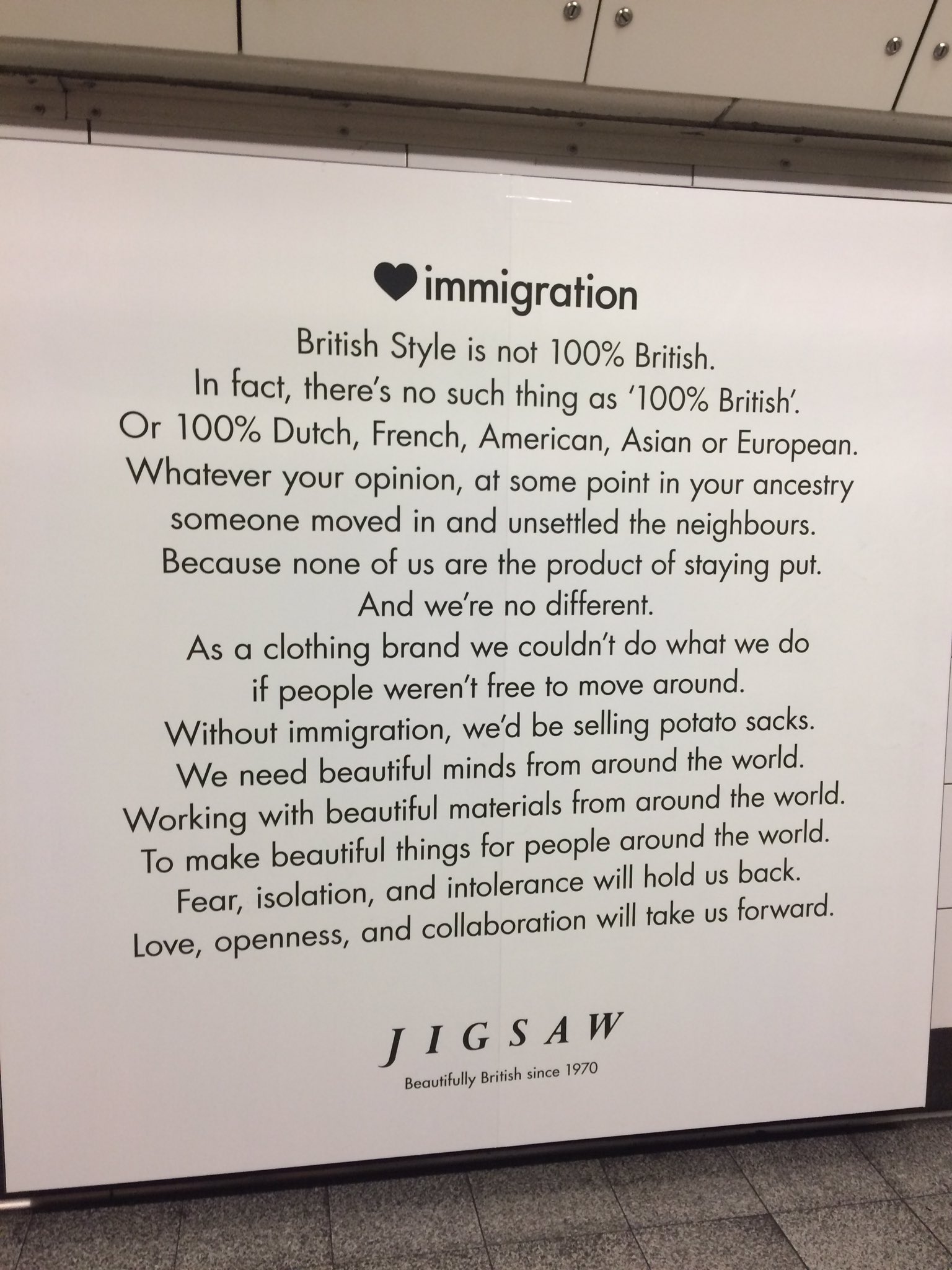
I’ve a feeling a lot of people will pick Jigsaw for their unambiguous celebration of immigation. I get uncomfortable with brands preaching politics, even if you agree with the politics – and I think the message loses impact by being too overt and preachy. However, a lot of people loved it. And I’m aware that the experience of encountering an ad in person is very different to seeing it online – I suspect it was quite moving to walk around the tube at Oxford Circus and feel the affirmative power of those ads.

On a related note, I wrote at length about brand purpose this year. While I’m sceptical about it as a core way of thinking about brands, I do think brands participate in culture and can do little things to shift norms. Casting a gay couple in an ad may seem like box-ticking, but these small acts add up to gradual normalisation – I just think they work better done quietly and modestly, rather than ‘look at us leading the revolution’.

timberland.jpg

As a response to these times, I prefer the humour of Timberland – a rare case of a brand trying to empathise with ‘millennials’ and getting it right.

BEST INFOGRAPHIC

Some quickfire ones now. Smart use of punctuation as data visualisation.

BEST DISINFOGRAPHIC

Contrast with this conspiracy infographic displayed on Fox News – like a map of its inner mind. (Both of these last ones via @michaelbierut)

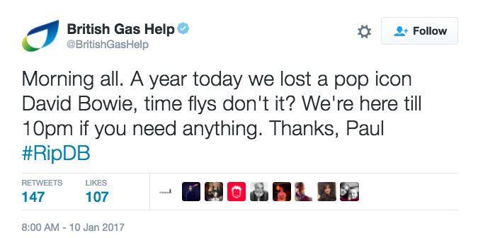
WORST BRAND TWEET

britishgas.png

An argument for using bots instead of humans to write tweets.

BEST BRAND TWEET

Also an argument for using bots instead of humans to write tweets. 

WORDPLAY OF THE YEAR

As with everything on the Internet these days, it’s hard to know if Photoshop was involved.* But I was impressed by this ‘found’ version of Wonderwall by @thepunningman.

* I can now confirm no Photoshop was involved. Hooray, some things are real.

PACKAGING COPY OF THE YEAR

RTYchocolate.jpg

OK, packaging copy. As usual, there was some heroic padding going on.

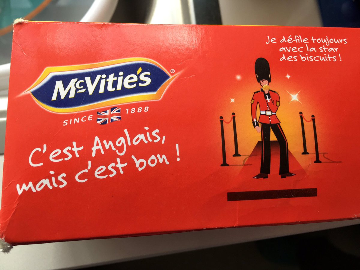
mcvities.jpg

And the saboteurs at McVitie’s casually dropped a line that translates as ‘It’s English but it’s good’.

RTYbuttercode.jpg

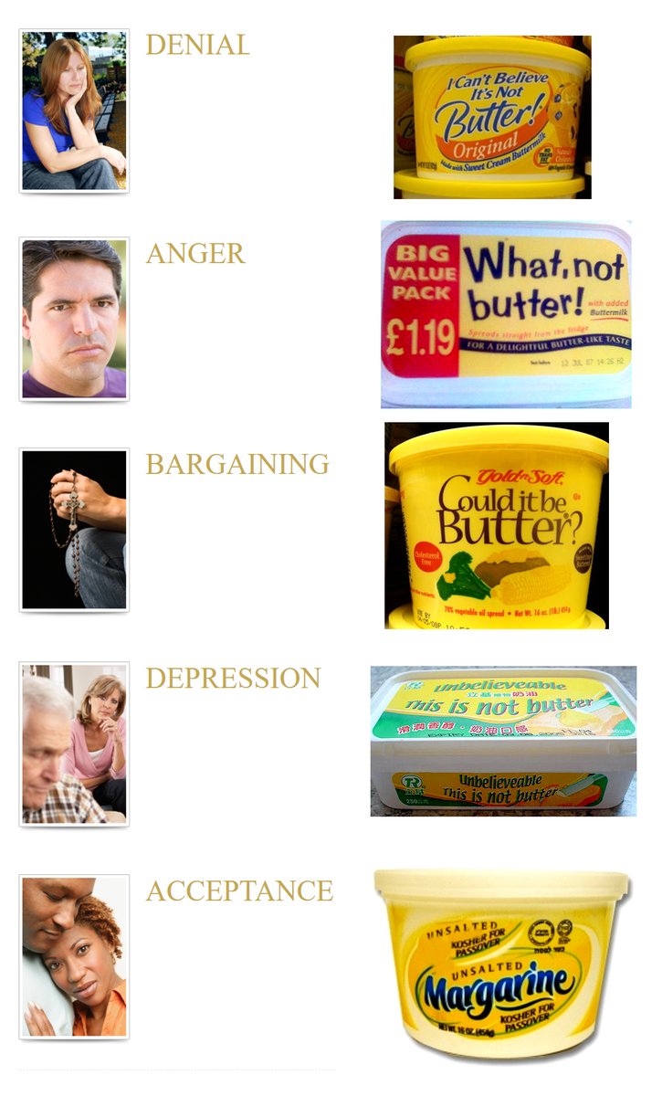
But this was mainly the year of funny tweets about packaging. Firstly, someone cracked the butter code.

Screen Shot 2017-12-11 at 13.39.25.png

And Alex Andreou realised what’s really going on with cereals.

But this Apple Juice observation was my favourite — go here to retweet it.

SLOGAN OF THE YEAR

beanz1.jpg

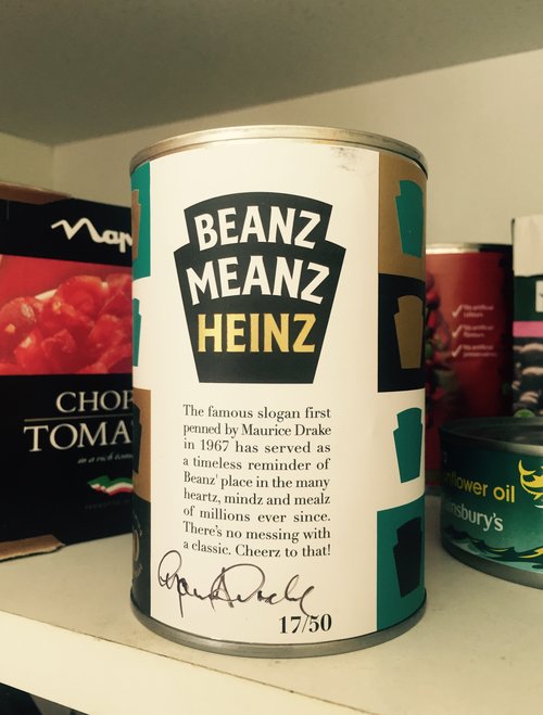
This was the year that Beanz Meanz Heinz turned 50 and was celebrated in an exhibition at Selfridge’s. I believe the correct hashtag is #copywritergoals

We also witnessed a slogan occurring to Donald Trump in real time.

prongles-hed-2017.jpg

Cards Against Humanity refocused their energies on Prongles – a real, unauthorised and widely distributed pastiche of Pringles. It was a convoluted joke and the target wasn’t especially clear. But the best thing about it was the slogan.

And in a new twist on slogans, probably my favourite of the year was Yes good by Emerald Nuts, taken from a real customer review on Amazon.

BEST COPY EDITING

Two winners here: Chuck Schumer for this letter about Senate oversight of Presidential nominations, in which he took a letter from Mitch McConnell (written in different political times) and sent it back to him. 

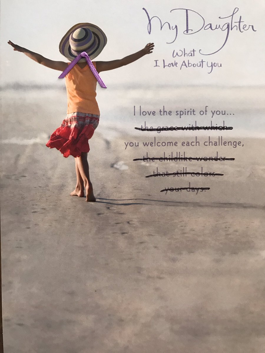
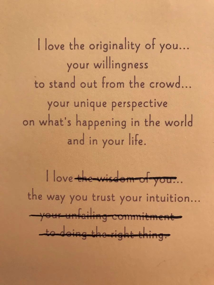
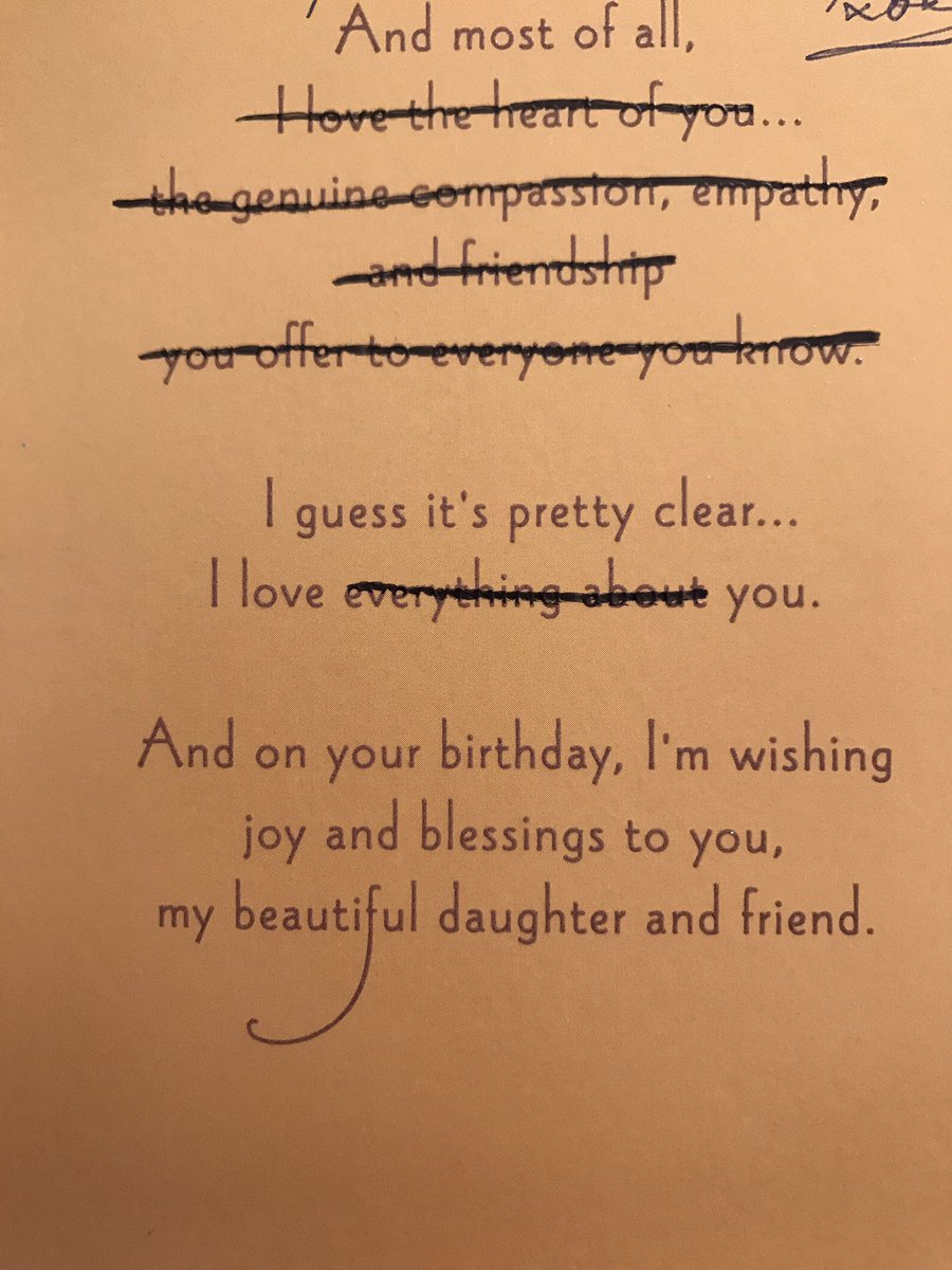
The other winner is this person’s dad for a brilliantly pedantic birthday card strategy in which he crosses out the bits that don’t apply. 

‘DESIGN FOR GOOD’ PROJECT OF THE YEAR

Here’s an example of a ‘design for good’ project without a fanfare, hashtag, case study video with Sigur Ros soundtrack, or story six months later about how it was all a scam.

TWITTER MOMENT OF THE YEAR

trumpexist.jpg

This was the year that Twitter moved to 280 characters, which turned out not to matter very much. Probably the best moment was when Trump ceased to exist...

... which had parallels with the silent News at Ten, probably the most eloquent commentary on 2017 that there has been.

ALL ABOUT ME

My personal highlight was the release of Sideways Dictionary, an online dictionary of analogies for technological terms, created in partnership with Jigsaw and the Washington Post – one of the most enjoyable and mind-bending things I’ve written.

Also, this year saw an updated version of Perpetual Disappointments Diary come out with Pan Macmillan, and a new version in the US with Chronicle Books. (Pic by @lettemoore)

And I briefly went viral with a piece for McSweeney’s and Louis Theroux said he loved it.

WISH FOR 2018

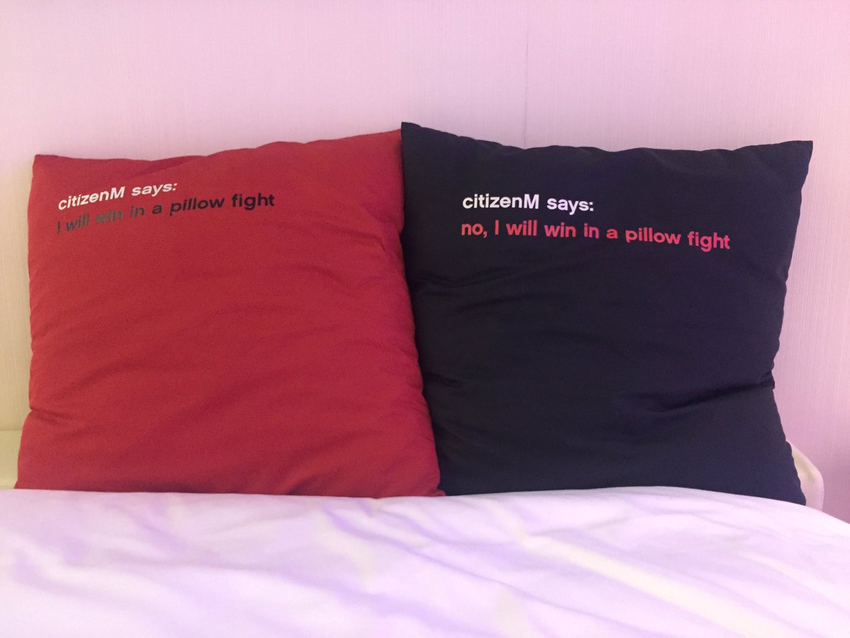
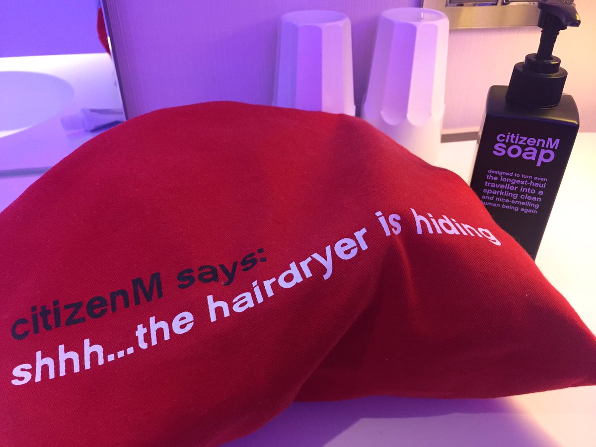
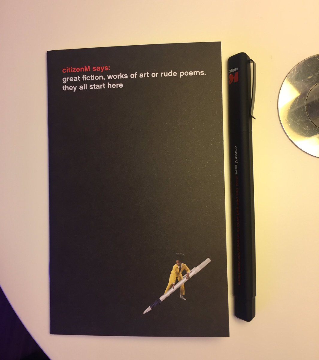
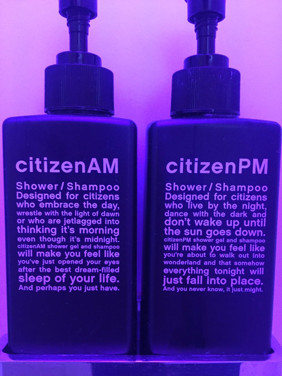
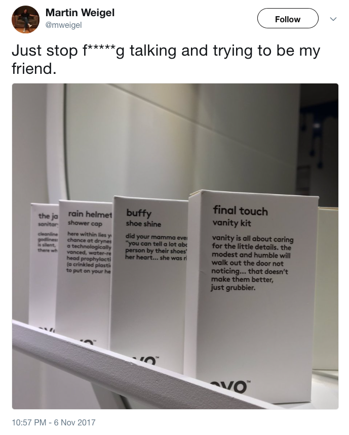
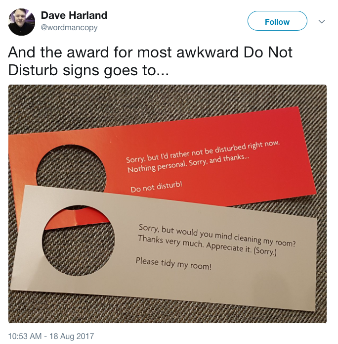
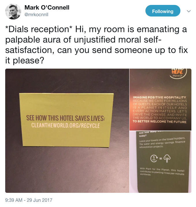
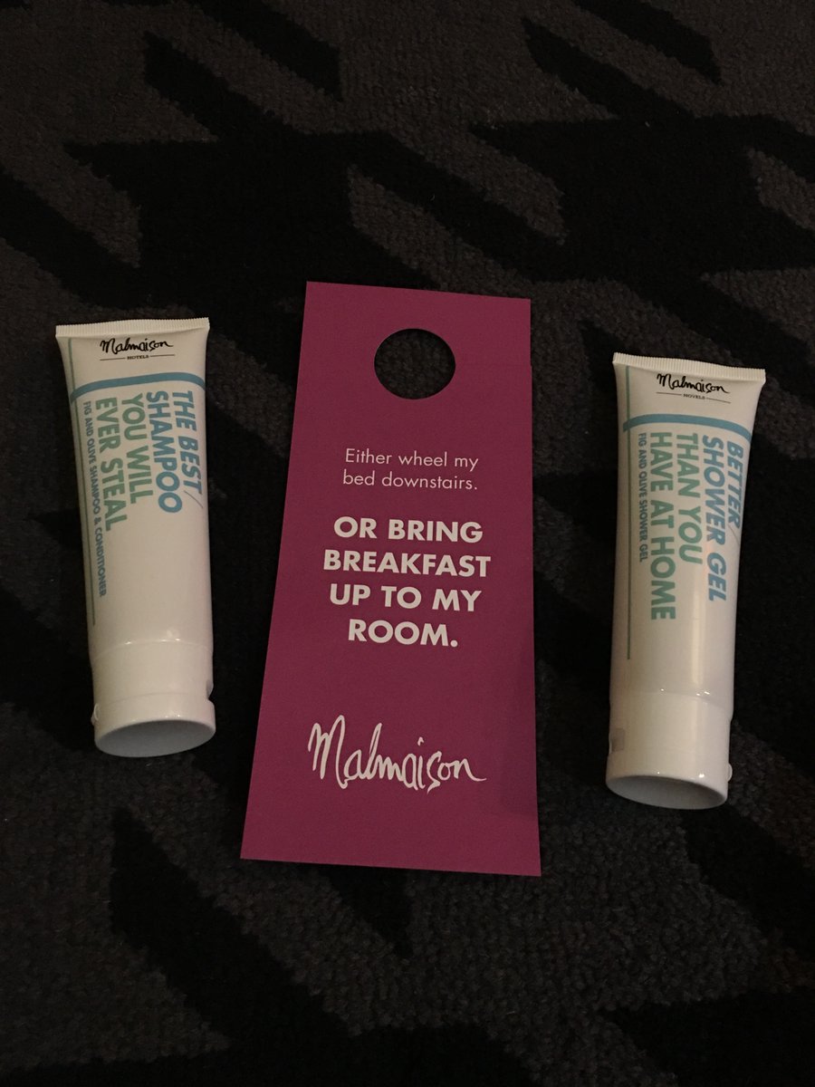
My wish for 2018 is for hotels to introduce tone-of-voice-free rooms. Over the summer, I stayed in a Citizen M hotel, which was great except for the cacophony of copywriting (all of which looks nice as individual executions on a screen, but less so when it’s combined into one room where you have to live and sleep).

I’ve collected a few other examples (scroll through above).

malmaison.jpg

To be fair, Malmaison is quite funny. But it takes a very funny joke to be funny the eighth time you read it.

THOSE WE LOST

Lots of people have sadly gone, some of them memorialised in Realtime Notes above.

And not forgetting Brenda Webb, who fell to Cher.

LINE OF THE YEAR

Not sure who came up with ‘The rest is science’, but it was a moment of genius. A reworking of the most beautiful dying words in literature (Hamlet’s ‘The rest is silence’) to mark the passing of a great scientific expedition. 

IMAGE OF THE YEAR

Trump before the Last Judgment. Although maybe it’s the image of next year. (Photo by @oss_romano)

That was quite a long review, wasn’t it?

Since you’re here...

Preamble: This is a post about the Guardian’s ‘Since you’re here’ ads inviting readers to become paying members, as an alternative to erecting a paywall. The ads have always bugged me because I think they could be much more persuasive. I first drafted this in October, then decided not to publish it. Instead, I emailed the Guardian directly – I wasn’t expecting a reply and, sure enough, didn’t get one. Around the same time, the Guardian announced how well its campaign was working. So I forgot about this post and left it in my drafts. But reading it again, I think it makes some good points. However well the strategy is doing, the copy could be a lot better. So, anyway. See what you think.

I try to read a wide mix of news sources, but for a long time my default option has been the Guardian. There are several reasons, but they all ultimately relate to its business model – no paywall, no billionaire owner, no government influence, and no shareholders apart from the Scott Trust.

The business model increasingly relies on voluntary donations from readers, either as one-off gifts or monthly payments. If you’re a Guardian reader, you’ll be aware of this, as most articles are interrupted at some point by this message:

It’s never struck me as a particularly effective message, persuasion-wise. Partly because it embodies the tone that all the Guardian’s critics hold against it. Earnest, slightly preachy, uncomfortable talking about money, very middle-class-guilt-trip-inducing.

Guardian critics would say that it’s therefore pitched perfectly for Guardian readers. And they might be right. Maybe a moral guilt trip is an excellent way to sell to Guardian readers. (Reports suggest readers have responded well enough.)

But I’m convinced they could do a lot better. It’s not just the tone of it – the messaging seems all wrong. Especially “We do it because we believe our perspective matters – because it might well be your perspective too.” It’s a neat enough turn of phrase, but it’s surely wrong for this age of bubbles and division. You shouldn’t be buying the Guardian because it parrots your ‘perspective’ back to you. And the Guardian is underselling itself in any case, because it doesn’t have one ‘perspective’ – it’s a platform for many perspectives. That’s one of its selling points.

Speaking of which, where are the selling points? The whole paragraph dwells on the Guardian and its future, but never connects it to the reader and what’s in it for them (apart from that unsatisfactory nod to echoing their perspective).

It’s frustrating because the Guardian at its best is full of wit, confidence and authority. And it’s an important cause – independent, investigative journalism is badly needed as a bulwark against the old enemy of Murdoch/Dacre and the new enemy of algorithm-driven fake news.

So given it’s a cause I believe in, I’m going to pitch some ideas to them. I wouldn’t normally do this and maybe it comes across as presumptuous, but it seems appropriate in this case. They’re not free ideas – there’s just no paywall. If they like them, they can pay me whatever seems fair.

First, here are some straight headlines, making the case concisely and with no excuse-me-sorry-about-this intro:

Investigative journalism
needs investment

To hold power to account
we count on you

No billionaire owner. No shareholders. No paywall.
There is no better model for fearless, independent journalism. But to keep delivering it, we need your support more than ever. (No pressure.)

Put those with a call to action, and you start to get a more confident, authoritative tone.

Or for a longer copy version:

You haven’t reached your article limit this month because there isn’t one. We plan to keep independent, investigative journalism free for everyone, regardless of income. So we’re not building a beautiful paywall, or even a renovated fence. But if you can afford a little to support us, you will be backing journalism that answers to no one except its readers. We know some powerful people would rather you didn’t do that. We’d love it if you did. 

What else? Maybe this:

You don’t have to subscribe to our point of view
to subscribe to the Guardian

That’s a better message than ‘it might well be your perspective too’, isn’t it? It broadens the market and suggests that Guardian readers are independent thinkers. 

You can also introduce a visual dimension. Use one of the many dramatic shots in the Guardian archive with this headline:

A thousand shots like this
for the price of a single espresso

That’s also an act of price anchoring – compare it to a coffee, something from the Guardian-reader world. And it’s selling a benefit to the reader, instead of appealing to guilt. Remind them what they’re getting for their money:

Your support means the world
and everything happening in it, every minute of every day

That’s a pretty good sell.

And remind them that it’s good value:

Good journalism matters more than ever
And actually costs less than ever

That’s true – if you give £15/month, it’s still less than it used to cost for a daily paper.

You can also try some caustic wit, and attack some agreed hate figures. Use a big picture of Trump/Dacre/Murdoch with:

He doesn’t want you to support us
but please do it anyway

or:

Without your support, journalism becomes a race to the bottom
Specifically, Murdoch’s bottom.
And then up it.

or maybe a picture of Boris Johnson with:

Leaders pay for their lies
when readers pay for our journalism

You can also tap into some of the people that Guardian readers like:

Please give Frankie Boyle a tenner
Or make a monthly gift to the grumpy git. 

Or why not showcase some of the brilliant writing that goes on every day in the Guardian, e.g.:

Boris, a malevolent baked Alaska, is living out in public the great dramatic sweep of a life that asks what if a hero, instead of a single tragic flaw, had all of them. Frankie Boyle

Every month, we publish about 90,000 sentences. This is one of them. A contribution of £20/month works out at 0.02p for the above sentence. We believe this is good value.

For specific things like the Patron scheme, you could try some self-deprecation:

Patronise the Guardian (for a change)
Get more from the Guardian. And help shape its future. Become a Patron. 

Finally, you could throw in a disclaimer:

Please don’t support the Guardian
... if you can’t afford it. We aim to bring independent journalism and informed opinion to everyone, everywhere, regardless of income. But if you can afford the price of an extra coffee or two every month without it being a stretch, then your support makes all the difference.

Maybe that’s a paternalistic, Guardian-y sentiment, but it’s an important one, and in terms of persuasion I suspect that *not* asking for money is a good way to get it. (Another thing that rankles about the existing ad is that phrase ‘a small favour’ – it’s not that small a favour for the just-about-managings.)

Anyway, those are some ideas. I genuinely support the Guardian’s business model and what’s at stake is more than just the Guardian itself – it’s the whole balance of the fragile news ecosystem online. We could be looking at a future of paywalled bubbles versus algorithm-friendly free news.

But it all depends on demonstrating the model can work – and it’s a tough persuasion challenge to get people to give money they don’t need to give. I think the Guardian could blaze a trail with this, but they have to come across as the smart, cool people – not the earnest vicar awkwardly shaking a collection tin.

Now I just need to get them to read this.  

Postamble: This post is a slight follow-up to a previous post about the New York Times ad campaign, which you can read here if you’re interested.