I've written a post for Creative Review about the new Coca-Cola Taste the Feeling campaign.
(Top image: 1939. Bottom image: 2016)


I've written a post for Creative Review about the new Coca-Cola Taste the Feeling campaign.
(Top image: 1939. Bottom image: 2016)
‘Review of the year’ is a grand title for what is mainly a review of things I’ve tweeted / favourited (now ‘liked’) over the last year. I’ve also been less active than usual online, so this will miss out a lot of things. But apart from that, here is my comprehensive and authoritative review of the year.
Best brand conversation
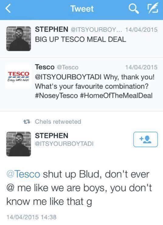
Brands having conversations are like people pretending to be on the phone. You chat away, nodding and chuckling at imagined jokes – but then the phone rings and everyone laughs and points at you. For a brand, there’s nothing more disconcerting than when a real person answers back. Tesco wins the best brand conversation award for the Twitter exchange above, closely followed by this one:

Worst brand conversation
This was the year that Andrex launched a five-step guide to wiping your backside and asked us all to have a conversation about it. I wrote about it here: Conversation my arse
Trend of the year (runner-up)

Brands doing feminism and getting it wrong. Sometimes it’s obvious and almost endearingly cack-handed, like Bic Pens celebrating International Women’s Day, or the recent IBM #hackahairdryercampaign. Other stuff gets celebrated widely, but is arguably worse. This Mindy Kaling article (last few paras) should be required reading for the Always and Dove marketing teams, who confidently tell the rest of the world how to do feminism, with the passion of a recent convert.
Non-trend of the year (winner)
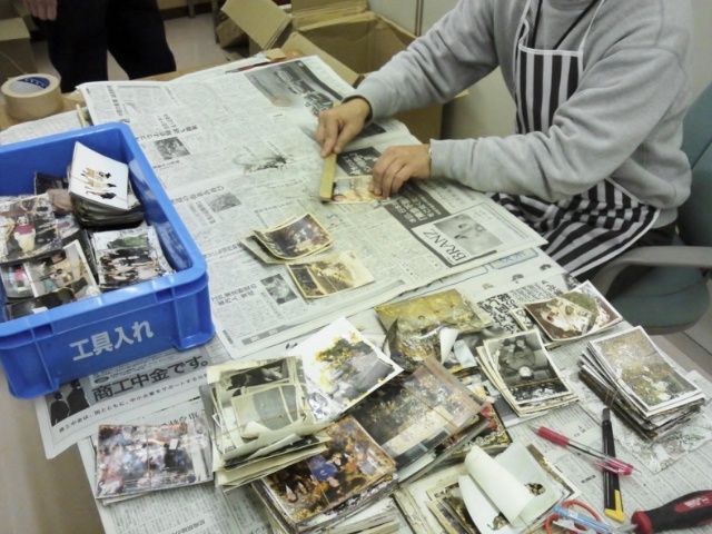
Non-trend, because it’s not something that happens much or gets shouted about. But there are examples of brands doing serious social good, without making a song and dance about it. This Ricoh Save The Memory project is a painstaking, years-long, open-source effort to rescue thousands of photographs lost and damaged in the Japanese tsunami of 2011. It’s properly useful, but it’s hard work.
Trend of the year (winner)

This probably has to be emojis. I don’t actually mind emojis – they’re fun. What grates is the media consensus that any project or press release that contains the word ‘emoji’ is now automatically and hilariously innovative and ‘now’. (Before this, it was ‘selfie’, which still retains some of its talismanic power, although it’s starting to wear off.)
So Domino’s wins accolades for ordering a pizza by emoji. Dove solves everything by releasing curly-haired emojis. McDonald’s upsets copywriters everywhere with an emoji-only ad (above – the last emoji was added by a member of the public).
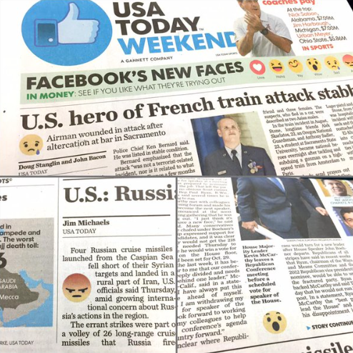
And the newspaper USA Today even included emojis to signal the tone of its stories – an experiment that has predictably been shelved.
All of this leads to horrified predictions of an illiterate, wordless future, but it’s mainly effective for its novelty value. Once someone has done an emoji-only ad, you really don’t need to do another.
Worst client of the year
The one brand that hasn’t done emojis is the Tokyo Olympics, where they would be quite appropriate. Instead, they win Worst Client of the Year for hanging their designer out to dry following pretty thin allegations of plagiarism, before launching another competition.
Fun project of the year
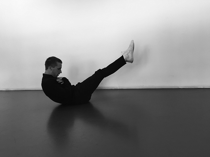
To prove that sports and branding can work together, this Logo Gymproject by Studio Dunbar is pretty invigorating.
Punctuation of the year
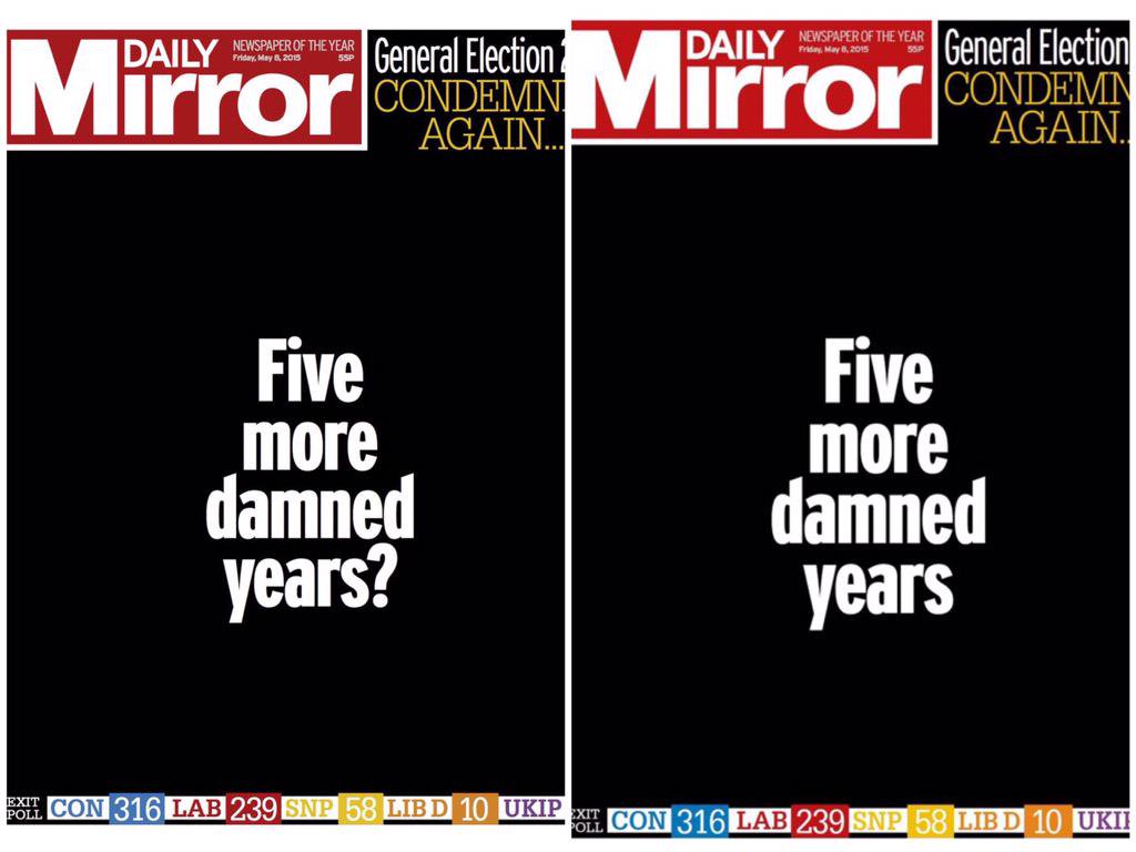
The mood of the UK election night was captured in the transition from the first edition of the Daily Mirror to the second, the last lingering hope deleted with the question mark.
Packaging copy of the year
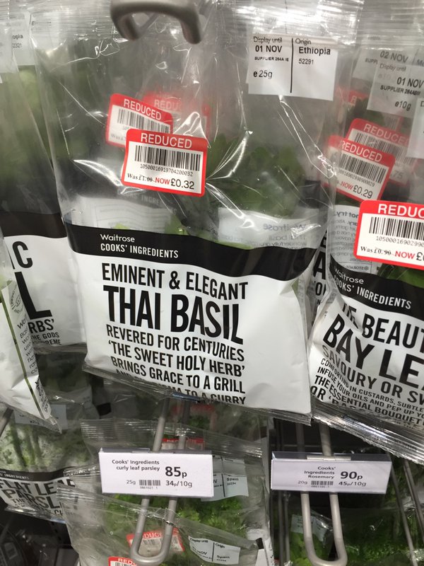
Always spoilt for choice with packaging copy. The prize has to go to Waitrose Cooks’ Ingredients. As @aljwhite pointed out, they are now starting to sound like Nicholas Witchell reporting on the Queen.
Mentions also for the most annoying bread in the world:

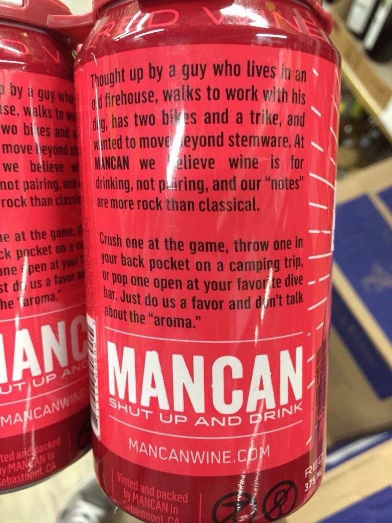
Washed down with some rugged wine (via @rhodri), which should have been called Man with a Vin.
And finally some cheese (via @betarish). I feel like I spent 11 months of this year making my way though the last line of this poem:

UI copywriting of the year
It’s not just packaging any more. One of the new frontiers for tone of voice is user interface copy. There is no error message or sign-up form that can’t be jazzed up with some chatty tone, like this error message:

Or this sign-up box:

This stuff extends to support services too. @howells tweeted this horror:

And there was a news story about Barclays threatening to give names and personalities to its new ATMs, including Sally and Jake. I’m not sure what Barclays’ demands are, but the nation will surely do anything to stop this from happening.
Worst naming project of the year
If it does happen, ATM Jake will have to compete with Storm Jake, one of a new front of branded storms that have been unleashed on the UK, following a competition by the Met Office to get the public to suggest names. To be fair, this stuff seems to be effective in raising ‘awareness’ of specific storms, which may have some public safety benefits. But you suspect it’s also about improving the Met Office’s social media metrics – metrics which it absolutely doesn’t need to have. Anyway, just like the US, we’ve gone with naming storms after people, which is simultaneously infantilising and sinister. It’s distressing enough for your house to be flooded, without it being by a storm called Phil. (Mind you, it’s better than a storm being sponsored by BMW and going on to take many lives.)
Worrying TOV development of the year

Speaking of UI copywriting, tone of voice has made its way onto road signs this year, in an experiment designed to increase public safety and reduce examples of road rage. I started and never finished a long blog post about this. The short version is I think it will briefly decrease and then steadily increase road rage.
Interesting TOV development of the year

This was also the year in which tone of voice guidelines went viral. The weird thing about the Warwick University backlash was that it’s not that extreme an example of the genre. But it doesn’t take much to produce a backlash these days.
Smart design move of the year

This was a smart way to reframe a two-star review from The Guardian.
Technology of the year
I like this story about how the humble whiteboard proved critical to negotiations with Iran.
Stupid job title of the year
Director of Modernise, Southwark Council.
Brand Darwin Awards Inaugural Winner
I wonder if there should be a Brand Darwin Awards, for brands that shoot themselves in the foot, and then the head. This year’s goes to Paypal for telling kids everywhere there’s no Santa (wrongly, because there is a Santa).
Brand psychopath of the year
I’ve argued before that brands are like psychopaths, ticking most of the boxes on the Hare PCL-R checklist. Even psychopaths deserve awards, so here goes:
The first of three winners is UBS for its grim ‘good father’ campaign (via @zarashirwan). See ‘Conning and Manipulativeness’ and ‘Shallow Affect’.

HSBC (the alleged money-laundering bank now threatening to leave the UK) ticks 'Lack of Remorse or Guilt' for advising us all to eat leftovers:

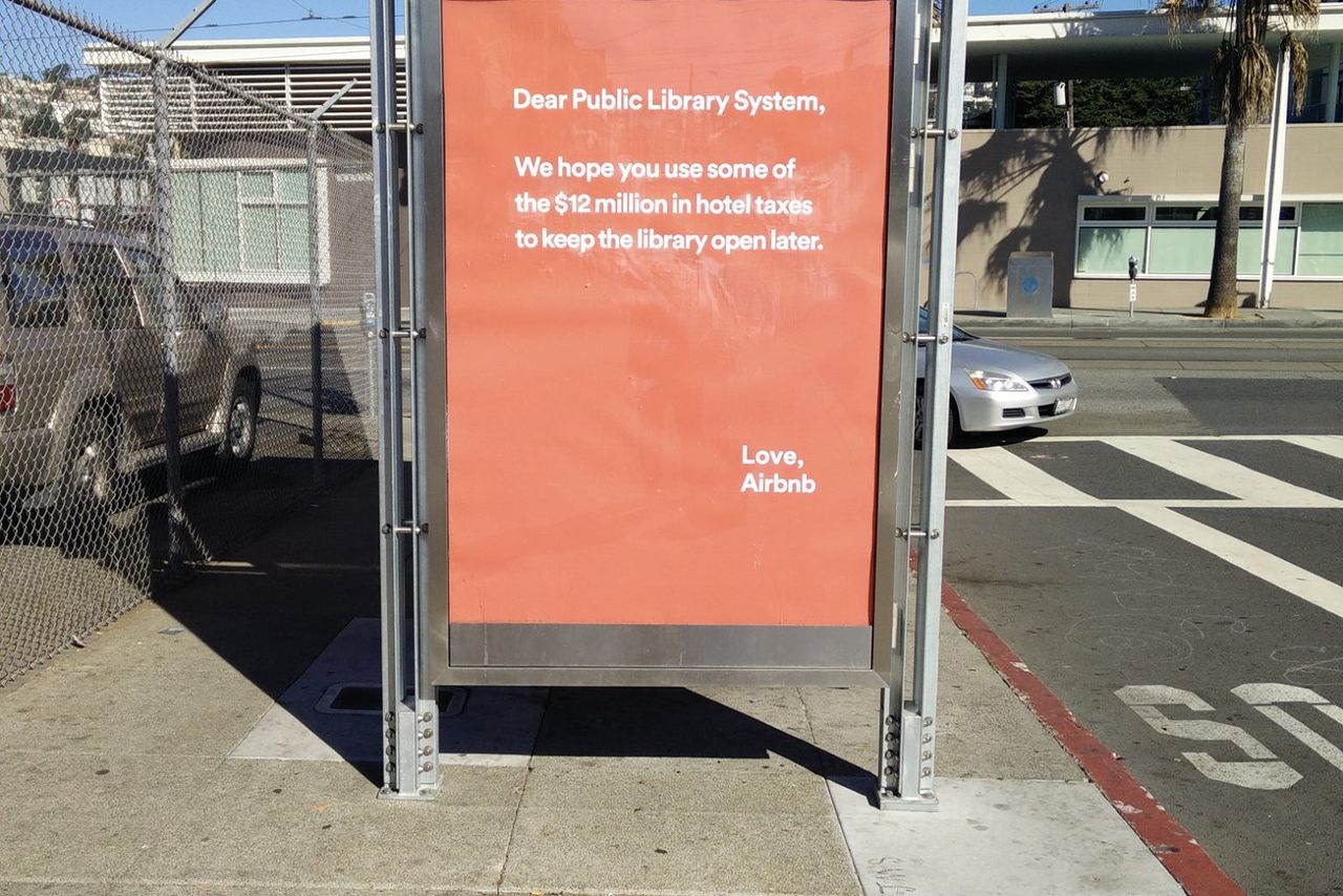
And AirBnB goes heavy on ‘Grandiose Self-Worth’ for its misjudged (and later withdrawn) hotel tax campaign, whose tone of faux-innocent entitlement is typical of too many brands today:
Two great design projects
Many more where these came from, but two that spring to mind are these ‘nostalgia for the future’ NASA posters:

And there was a particularly fine D&AD Annual cover this year by David Pearson et al.

Long copy of the year

An entire novel on a double page spread.
Short copy of the year

This obituary. You learn a lot about Doug from these two words. No nonsense, enjoyed a joke, everyone knew him. Short copy can say a lot.
Creative project of year

One of them anyway. I loved the Partick Thistle mascot by David Shrigley. A collaboration between the art world and football could have been patronising or gimmicky, but this was done in the right spirit – the mascot (Kingsley) captures the cheerful angst of watching your local team. The media tried to create a ‘backlash’ story against it, full of quotes from aghast tweeters, but most were actually joining in on the joke.
Image of the year
The most powerful image of the year was the photo of Aylan Kurdi, the Syrian boy washed up on a beach in Kos, which doesn’t need to be posted again here.
On a more surreal note, this was a real thing that happened in the UK:

Line of the year
It’s already become over-familiar after being quoted by Cameron and others, but in a year bookended by Charlie Hebdo and the Bataclan, ‘You ain’t no Muslim bruv’ was a concise and humane rebuttal of a whole narrative.
To end on a happier note:

Festive greetings to one and all. (This is a pic from last year, from Sale Appliances in Southend. Henry is one of the great underestimated brands.)
Thanks to anyone involved in all the tweets and links above – I’ve tried to cite sources where I can.
NB: If you liked 2015, you might like the prequel: Rough notes on 2014
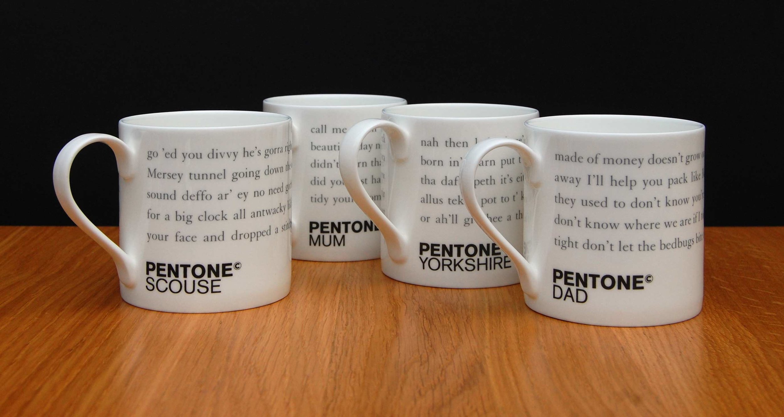
We’ve put four new Pentone mugs in the shop today.
Pentone is our not-entirely-serious system for dividing written language into different ‘tones of voice’ in the same way that Pantone does for colour.
The new mugs include:

Pentone Yorkshire
A rewritten version of our previous Pentone Yorkshire mug. Perfect with Yorkshire Tea. Or just a good way to patronise a northern friend.

Pentone Scouse
One half of Asbury & Asbury is from Liverpool, so we are allowed to do this.

Pentone Dad
Don’t look at me in that tone of voice

Pentone Mum
You’ll buy it and you’ll like it.
All mugs are English fine bone china, hand-decorated in the UK, dishwasher and microwave proof, white on the inside (important for making tea) and a good, satisfying size.
There aren’t that many of them, so please factor rarity into your purchasing state of mind.

Pentone Boxset
There is also this bumper boxset of 30 tones. But don’t pour tea into it.
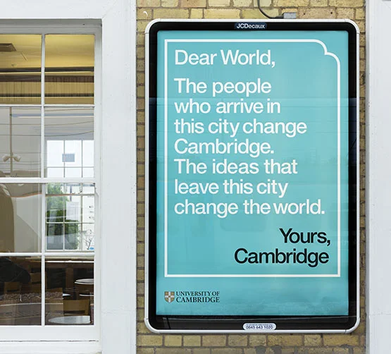
It was a great pleasure to be involved in this University of Cambridge campaign with johnson banks.
The campaign celebrates and amplifies the two-way relationship between Cambridge and the world, using a letter-writing framing device to host all manner of visual and verbal content.
The sheer richness of material inside an institution like Cambridge makes it an especially interesting one to write.
You can read the full background in three parts on the johnson banks blog.
The posters (a few examples below)


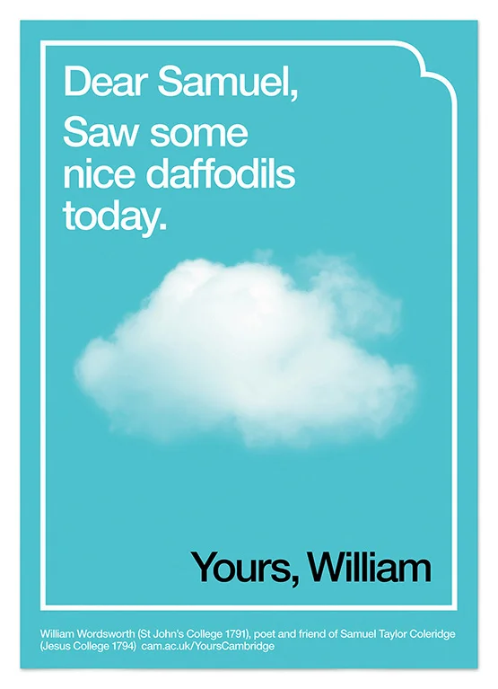


Photo by cbower2366 on Instagram
Just back from an extended trip to Philadelphia to talk at the Society of Design conference. It took place in the Harrison Auditorium in Penn Museum and was hosted by Craig Welsh of Go Welsh.

Photo by wittynoggin on Instagram
As part of my talk, I revived the rearranging-corporate-copy idea of Corpoetics to write a poem based on Go Welsh’s profile copy.

Photo by @themodernchris on Twitter
I also took the chance to talk about a few interesting pieces of writing spotted over the last year or so.

Photo by thatgreenalien on Instagram
And it was my first opportunity to talk about a new version of this book, which will be coming out early next year.
The best part was being able to hear from six other speakers, all from different disciplines. To give an idea of the range:

John Ryan talked about his work as Director of Interaction Design at Local Projects, including this City Pulse installation at One World Trade Center.
Visit the Audi Q3-Special at: http://www.youtube.com/audiq3 "All you need is less"
Oskar Zieta talked about his studio’s mind-boggling technique for inflating steel with high-pressured air to create strong but lightweight forms, for use in everything from furniture to space stations.

Spencer Charles and Kelly Thorn spoke about their beautiful work, previously for Louise Fili and now independently – I was a particular fan of this layered ampersand poster.
Alisa Wolfson gave an insight into design as part of a big ad agency – she heads the Department of Design at Leo Burnett in Chicago. Recipeace is the award-winning D&AD White Pencil project, but I also liked this single-minded branding work for McDonald’s.

Craig Dykers runs architectural firm Snøhetta, which is responsible for a wonderful array of buildings, including The Norwegian National Opera and Ballet and the 9/11 Memorial Museum Pavilion.

When Snøhetta turned its attention briefly from architecture to graphics, it immediately created one of the stand-out projects of the last decade. These Norwegian banknotes won a competition a while back and are coming into circulation next year.

Finally, Annie Atkins talked about her graphic design work for The Boxtrolls and The Grand Budapest Hotel. Not only great work, but also a fascinating story told with clarity and humour.
Thanks to Craig Welsh and everyone who provided such gracious hospitality.