The results of the D&AD New Blood Awards were announced last night – essentially the 'student' awards, but open to any young person who wants to have a go. The awards take the form of a series of briefs which entrants from all over the world can choose to tackle. I was a judge on the Sky copywriting brief and was bumped up to Foreman when someone had to drop out.
I’ve been involved in professional judging before, but in some ways the responsibility feels bigger here, as you’re aware how much is riding on it for the entrants. An award can be a major boost at the beginning of a career, and having a brilliant piece of work unfairly overlooked can be a real downer that lingers with you for years.
Our brief boiled down to ‘create a copy-led campaign promoting the Sky brand’ – a tricky but interesting challenge for what is, on the face of it, a visual brand. There were 12 in-books, of which four were ‘nominated’ (a big achievement) and of those four, two won a pencil.
The first was Telescopic Nostalgia by Adam Newby and Will Wells from School of Communication Arts 2.0. It's an interestingly heritage-based route for a technology/media brand – appropriate when you realise Sky has been around for 25 years. Each execution relates various Sky breakthroughs to the cultural context of the times, using an interactive device called ‘telescopic text’, so that a short version of each line expands into a longer version when you swipe it. The device is borrowed from telescopictext.com but the execution is skilful and feels right for a screen-based brand.
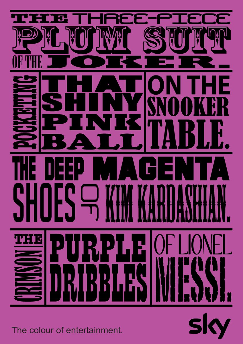
The second pencil went to The Colour of Entertainment by Lyle Martin and Viloshan Appasamy of the Vega School of Brand Communications, Cape Town. The idea is a verbal extension of Sky’s visual brand, where the colour spectrum is a key element. Each execution takes a colour from the spectrum and relates it to the full range of Sky’s programming using a series of evocative phrases.
The posters ignored one of the few ‘mandatories’ in the brief, which was to include Sky’s ‘Believe in better’ brand line as a sign-off. After some debate, the feeling was that it was so firmly rooted in the Sky brand in other respects that it earned the right to drop the line. But it highlights a paradox in the judging generally, where on the one hand you’re looking for evidence that people can follow a brief professionally, but on the other hand encouraging bravery and rule-breaking. In the end, what matters is whether the work is any good.
It would take too long to talk about all the other entries in detail, but I was a big fan of ‘You're better off watching it’ – by Alvaro Palma Tara, Juan Álvarez Porto and Kike Garran of the Miami Ad School, Madrid – in which people humorously fail to describe brilliant TV moments. It’s edited with a comedian’s sense of timing and it plays into a key truth about why people subscribe to Sky – that fear you have as a consumer of missing out on stuff that everyone else is talking about.
I was also involved in the Black Pencil judging, where the best entries from each category compete for the highest award.
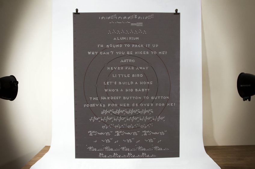
The first winner was Three for XL recordings, by Anna Barton, Louise Delves and Sam Smith from Kingston University – a beautifully crafted interactive poster where sections are torn off and played through a punch paper music box.
And the other Black Pencil went to The Green Switch by Paul J. de Ridder and Yme Gorter of Edinburgh Napier University. The (ambitious) brief was to create an idea to fight climate change on a large scale. This solution proposed modifying Google's search algorithm to take sustainability into account, so that eco-friendly companies and products are rewarded with higher search results. You can argue about the feasibility, but it's exactly the right kind of thinking – a systemic change that could have a big effect without people having to do much.
While it didn’t get a Black Pencil, this campaign for the National Trust deserves singling out (by Robert Sewell and Vytautas Busma, University of Gloucestershire). It owes a lot to Adam Buxton and it’s stupid and over the top, but I love the way it reinvents a brand in a way you can almost see working. The entrants had the nerve to release it as a ‘leaked advert’ on YouTube, where it went viral and won coverage in the national press, subsequently attracting positive attention from the National Trust themselves. It’s exactly the type of irreverent, boundary-pushing work students should be doing.
For those who didn’t get in-book, I would say a lot of the work showed flashes of skill and talent – many of the entrants clearly knew how to write a decent headline and will probably go on to have brilliant careers, regardless of whether they happened to impress a particular group of judges on a particular day. (I would even say sometimes it’s better to be Will Young than Gareth Gates, but I’ve worked out most of the entrants would have been about six years old when that happened.)
The exhibition graphics and branding by The Office of Craig Oldham also deserve a mention – a strong, humorous voice carried through into every element. The hoardings around the exhibition space in Spitalfields Market had a real presence – I can imagine a lot of members of the public being engaged and entertained by it. It was good to see some of the work recognised in Writing for Design in the D&AD Professional Awards.
And before leaving the subject of awards, I was pleased to be involved in a project for Cystic Fibrosis that made it in-book in Writing for Design this year. The idea for a writing-led identity was down to Johnson Banks and I helped with some of the executions. But I think it’s a nice example of a writing-based identity that does a serious long-term job for a client.
This post took ages to write.


