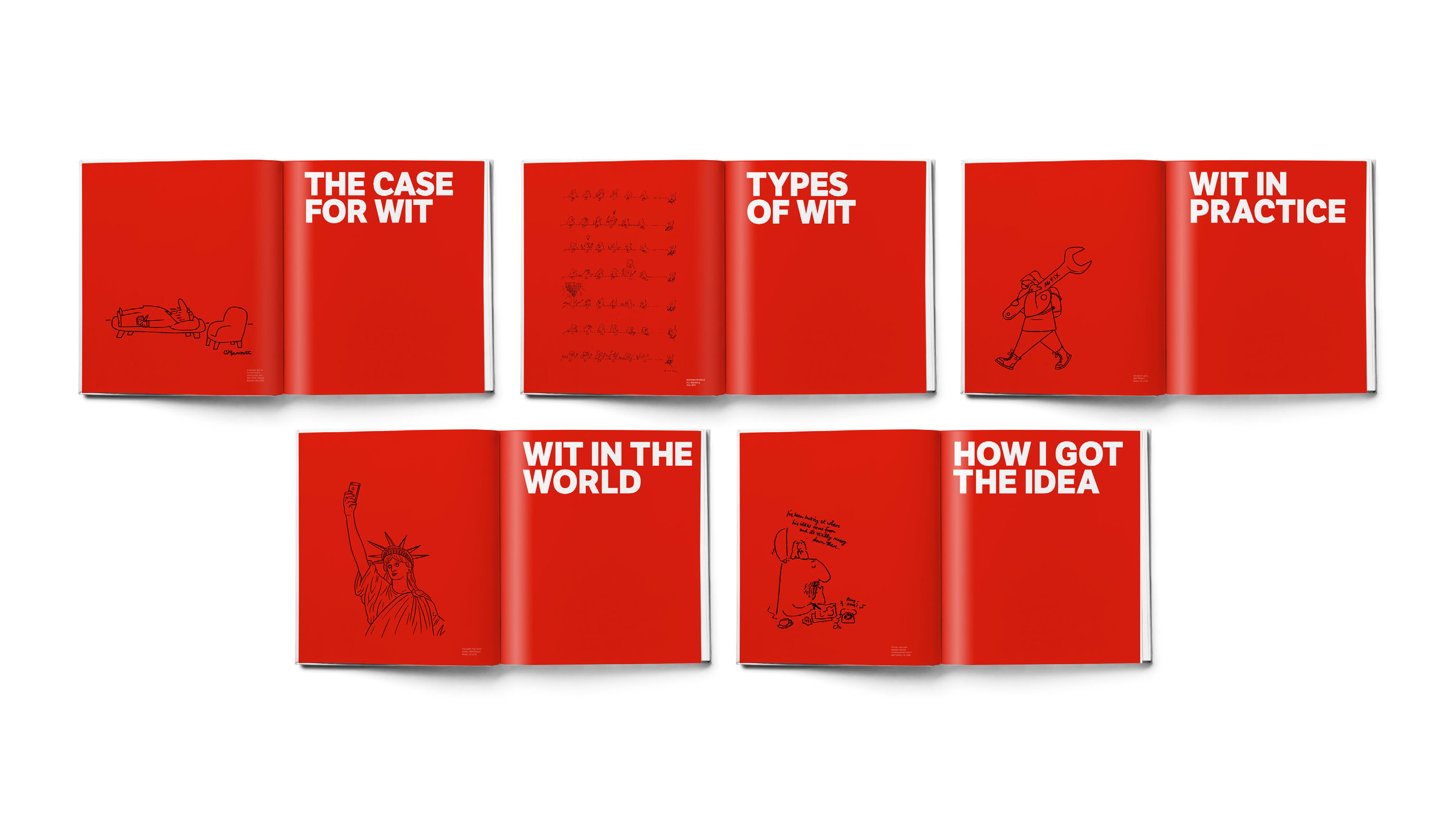
Pre-order copies are starting to land of the new edition of A Smile in the Mind: Witty thinking in graphic design – in shops from 9 March 2016 – so it feels like it’s time to blog about it.
It’s been an honour to co-author the new edition alongside Greg Quinton of The Partners, updating the influential original by Beryl McAlhone and David Stuart.
I remember coming across A Smile in the Mind for the first time when I got my first agency job in 1996. In retrospect, I realise it had only just come out, but it already felt like it had been around for ever. A compendium of ideas-led work with illuminating commentary and interviews, it was the go-to book for every creative looking for inspiration. In those days before the internet and countless creative blogs, it was a treasure trove of work gathered from the previous decades – like a compressed version of 30 D&AD Annuals.
A book full of ‘penny-dropping’ moments, it represented a penny-dropping moment for people of my generation. I remember that feeling of realising I’m not just here to write, but to have ideas (and realising how inseparable the two things are).
The new book is about 50% new material mixed with the most enduring of the old. There’s a lot of new writing and commentary, as well as the original ‘Case for Wit’ section that Beryl McAlhone wrote 20 years ago (complete with warnings about the straining too hard for an idea and getting caught up in designer jokes).
One of the privileges of working on the update was the chance to interview some great people for the closing section – including Noma Bar, Michael Johnson, Sarah Illenberger, Christoph Niemann, Dean Poole and Jim Sutherland.
I also had the task of editing the original text, including the melancholy role of switching to past tense when referring to greats like Saul Bass, Alan Fletcher, Shigeo Fukuda, Abram Games, John Gorham, Marcello Minale and Paul Rand. One reason for doing an update as opposed to a whole new book was to keep alive the influence of these greats of the past, which feels even more fresh and immediate when it’s mixed in with the more recent work.
The central argument of the new book is that wit has ‘scaled up’ in the last 20 years. Wit powers big brands and energises social causes. It’s there not just in the way products are marketed, but also in the products themselves. And it’s more democratic than ever – evident in protest branding and the instant ‘homage’ that greets every new brand launch. Wit is a way of making sense of the world, even or especially in times of crisis. For recent examples (too recent for the book), see the Jean Jullien response to the Paris attacks – classic graphic ‘wit’ but the opposite of laugh-out-loud – or the many visual tributes to David Bowie.
I’ll blog more about the book and the thinking behind it. For now, I should record my thanks to Greg Quinton for getting me involved and steering the whole book into being. Thanks also to Jonathan Brodie, designer at The Partners, who spent countless late nights making the book look as good as the work in it. And thanks to Beryl McAlhone and David Stuart who were gracious in allowing us to revisit their original, which must have been a weird feeling.
As Greg and I say in the Preface, we’ve approached this update with a sense of gratitude to the original and in the spirit of paying it forward to the next generation.


